堆叠条形图在视觉上比较数据时非常有用。让我们看看如何在R编程语言中创建一个堆叠条形图,设置其颜色,添加图例、名称,并创建分组条形图,并附带一个示例。
在我们开始堆叠条形图示例之前,让我们先看看我们将要用于此条形图示例的数据。首先,employee是我们先前文章中使用的日期集。
在R语言中创建堆叠条形图
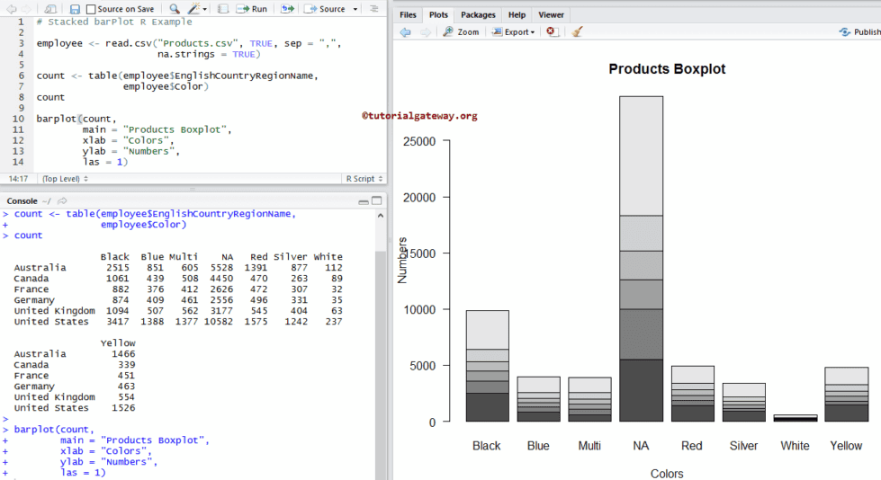
此示例演示了如何使用外部数据创建堆叠条形图。在此示例中,我们使用read.csv函数从CSV文件导入数据。
我建议您参考R读取CSV文章来了解导入CSV文件涉及的步骤。此外,还请参考R语言条形图文章。
# Read Data from CSV File
employee <- read.csv("Products.csv", TRUE, sep = ",", na.strings = TRUE)

count <- table(employee$EnglishCountryRegionName, employee$Color)
count

barplot(count)
以下R语言编程语句创建了一个包含国家和颜色记录的表。这里,列值是唯一的颜色,行值是唯一的国家名称。
count <- table(employee$EnglishCountryRegionName, employee$Color)
接下来,我们使用上述指定的表创建一个条形图。
barplot(count)
为R语言中的堆叠条形图指定名称
在此示例中,我们使用main、xlab和ylab为堆叠条形图、X轴和Y轴指定名称。
- main:您可以更改或为堆叠条形图提供标题。
- xlab:请指定 X 轴的标签。
- ylab:请选择Y轴的标签。
- las:用于更改Y轴值的方向。
employee <- read.csv("Products.csv", TRUE, sep = ",",
                     na.strings = TRUE)

count <- table(employee$EnglishCountryRegionName,
               employee$Color)
count

barplot(count,
        main = "Products Boxplot",
        xlab = "Colors",
        ylab = "Numbers",
        las = 1)
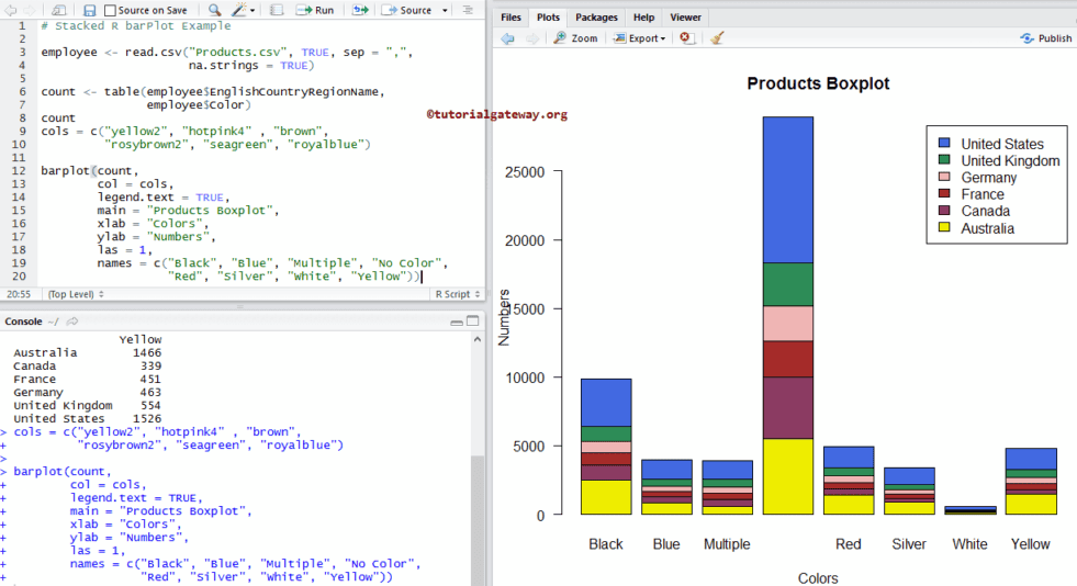
在此示例中,我们使用col参数更改堆叠条形图的颜色。
- col:请指定您想用于条形图的颜色。这里,颜色按国家名称区分。在您的控制台中键入colors()以获取R编程中可用的颜色列表。
- names:请为堆叠指定名称。这里,我们正在更改名称。
employee <- read.csv("Products.csv", TRUE, sep = ",",
                     na.strings = TRUE)

count <- table(employee$EnglishCountryRegionName, employee$Color)
count
cols = c("yellow2", "hotpink4" , "brown",
         "rosybrown2", "seagreen", "royalblue")

barplot(count,
        col = cols,
        main = "Products Boxplot",
        xlab = "Colors",
        ylab = "Numbers",
        las = 1,
        names = c("Black", "Blue", "Multiple", "No Color",
                  "Red", "Silver", "White", "Yellow"))
为R中的堆叠条形图添加图例
在此示例中,我们使用legend.text参数为堆叠条形图添加图例。
- 如果指定legend.text = TRUE,图例值将自动分配,或者
- 您可以使用字符向量作为图例值。例如,legend.text = c(“black”, “blue”, “green”, ..)
employee <- read.csv("Products.csv", TRUE, sep = ",",
                     na.strings = TRUE)

count <- table(employee$EnglishCountryRegionName, employee$Color)
count
cols = c("yellow2", "hotpink4" , "brown",
         "rosybrown2", "seagreen", "royalblue"

barplot(count,
        col = cols,
        legend.text = TRUE,
        main = "Products Boxplot",
        xlab = "Colors",
        ylab = "Numbers",
        las = 1,
        names = c("Black", "Blue", "Multiple", "No Color",
                  "Red", "Silver", "White", "Yellow"))
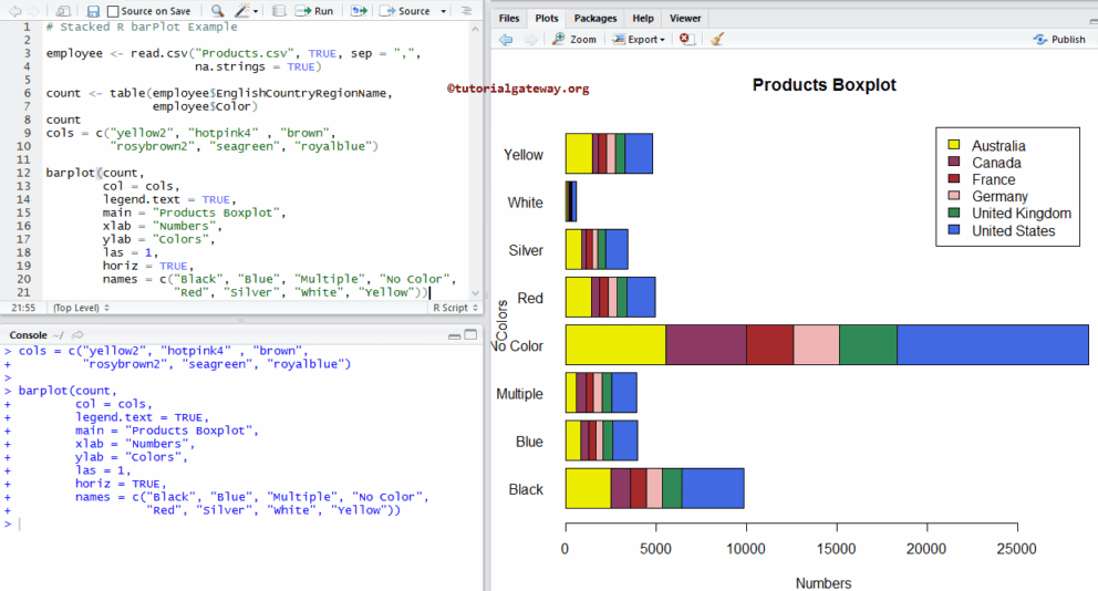
水平堆叠条形图
在此示例中,我们使用horiz参数将默认的垂直堆叠条形图转换为水平条形图。
employee <- read.csv("Products.csv", TRUE, sep = ",",
                     na.strings = TRUE)

count <- table(employee$EnglishCountryRegionName,
               employee$Color)
count
cols = c("yellow2", "hotpink4" , "brown",
         "rosybrown2", "seagreen", "royalblue")

barplot(count,
        col = cols,
        legend.text = TRUE,
        main = "Products Boxplot",
        xlab = "Numbers",
        ylab = "Colors",
        las = 1,
        horiz = TRUE,
        names = c("Black", "Blue", "Multiple", "No Color",
                  "Red", "Silver", "White", "Yellow"))
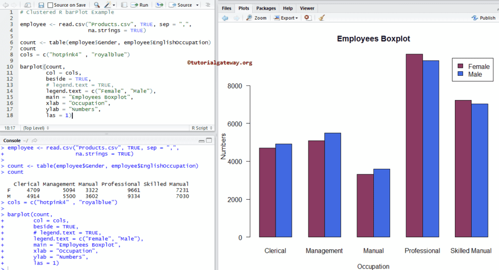
在R语言中创建分组条形图
在此示例中,我们使用beside参数创建了一个分组条形图。
employee <- read.csv("Products.csv", TRUE, sep = ",",
                     na.strings = TRUE)

count <- table(employee$Gender, employee$EnglishOccupation)
count
cols = c("hotpink4" , "royalblue")

barplot(count,
        col = cols,
        beside = TRUE,
        # legend.text = TRUE,
        legend.text = c("Female", "Male"),
        main = "Employees Boxplot",
        xlab = "Occupation",
        ylab = "Numbers",
        las = 1)