R ggplot2 散点图有助于可视化任意两个数据集之间的关系。让我们看看如何使用 R 编程语言中的 ggplot 创建、设置其大小、形状和颜色、添加线性回归、更改散点图的主题,并附带一个示例。
在此 ggplot 散点图演示中,我们将使用 R 编程提供的 diamonds 数据集。
使用 R 中的 ggplot2 创建散点图
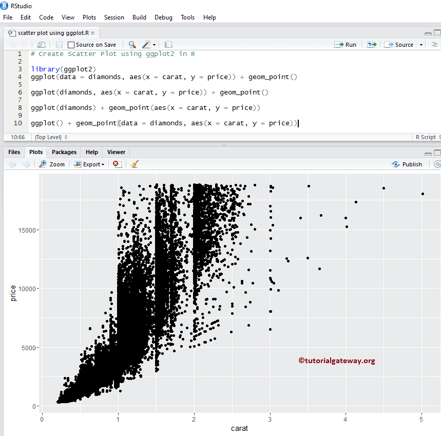
此示例向您展示了使用此包创建散点图的各种方法。我们使用 RStudio 提供的上述 diamonds 数据集。
提示:ggplot2 包默认未安装。请参阅安装软件包文章以安装R 编程软件包。
# Create
# Importing the ggplot2 library
library(ggplot2)

# Default way
ggplot(data = diamonds, aes(x = carat, y = price)) + geom_point()

# Approach 2
ggplot(diamonds, aes(x = carat, y = price)) + geom_point()

# Approach 3
ggplot(diamonds) + geom_point(aes(x = carat, y = price))

# Fourth Approach
ggplot() + geom_point(data = diamonds, aes(x = carat, y = price))
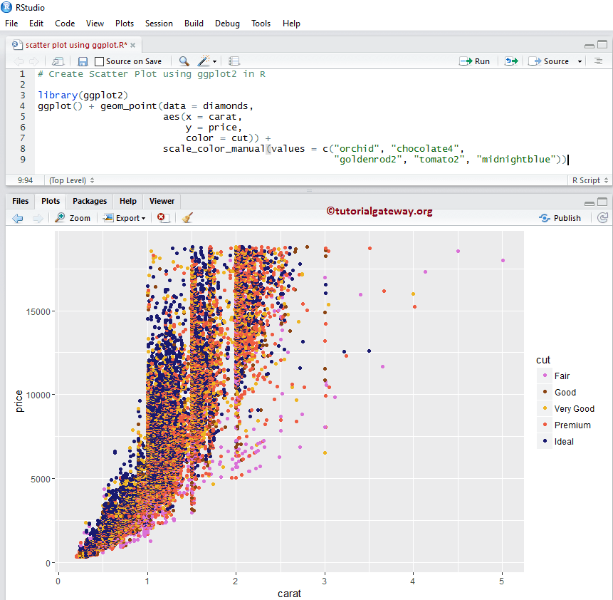
使用 R 中的 ggplot2 更改散点图的颜色
在此示例中,我们更改了 R 中 ggplot 绘制的散点图的颜色。
- 颜色:请指定您要使用的颜色。例如“red”、“blue”、“green”等。在此示例中,我们将 cut 列中的值用作颜色。您可以尝试将其更改为任何其他列。
- scale_color_manual:默认情况下,color 参数会分配一些默认颜色,要更改此设置,我们可以使用此函数。从下面的代码片段中,您可以看到我们为每个 diamond cut 分配了一些随机颜色。
注意:如果您需要从外部文件导入数据,请参阅R 读取 CSV文章以了解导入 CSV 文件。
# Changing Colors
library(ggplot2)
ggplot() +
        geom_point(data = diamonds,
                   aes(x = carat,
                       y = price,
                       color = cut)) +
        scale_color_manual(values = c("orchid", "chocolate4",
                                      "goldenrod2", "tomato2", "midnightblue"))
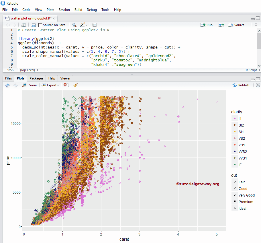
使用 R 中的 ggplot2 更改散点图的形状和大小
在此示例中,我们更改了 R ggplot 散点图中点的尺寸和形状。
- 形状:此参数可以帮助您将默认的点更改为任何其他形状。也可以像本例中那样,将任何列的值分配给它。
- 大小:它有助于改变每个点的大小。
# Changing Shapes
library(ggplot2)
ggplot(diamonds)  +
  geom_point(aes(x = carat,
                 y = price,
                 color = clarity,
                 shape = cut)) +
  scale_shape_manual(values = c(1, 4, 9, 7, 5)) +
  scale_color_manual(values = c("orchid", "chocolate4", "goldenrod2",
                                "pink3", "tomato2", "midnightblue",
                                "khaki4" ,"seagreen"))
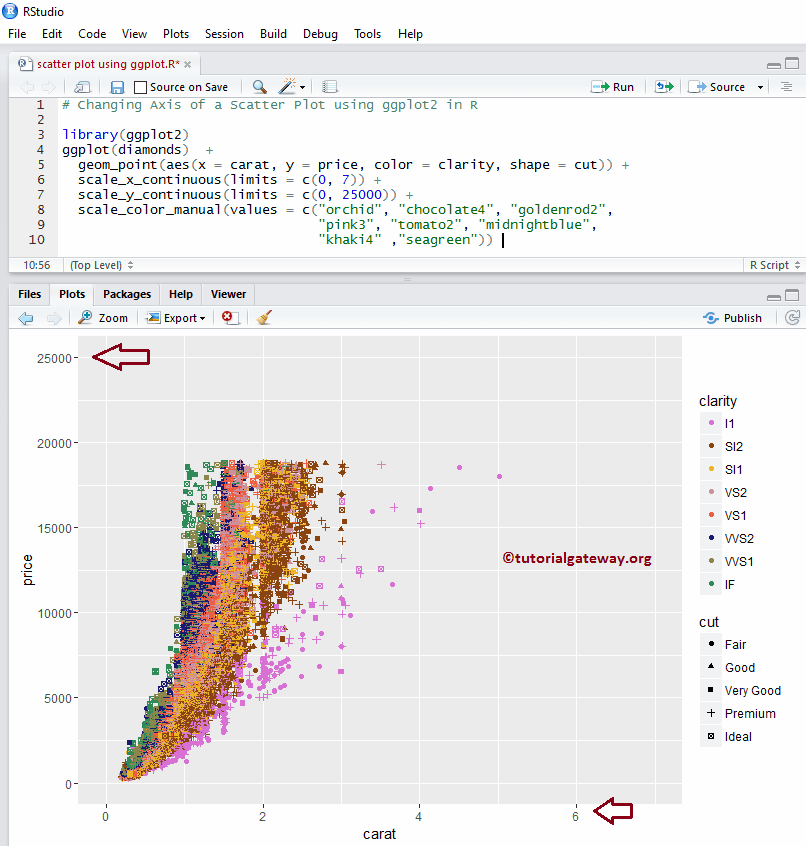
使用 ggplot2 更改散点图的轴
在此 R 示例中,我们展示了如何更改 ggplot 散点图绘制的默认轴限制。
- scale_x_continuous:此函数可帮助指定 X 轴的限制
- scale_y_continuous:它有助于指定 Y 轴的限制
library(ggplot2)
ggplot(diamonds)  +
  geom_point(aes(x = carat, y = price, color = clarity, shape = cut)) +
  scale_x_continuous(limits = c(0, 7)) +
  scale_y_continuous(limits = c(0, 25000)) +
  scale_color_manual(values = c("orchid", "chocolate4", "goldenrod2",
                                "pink3", "tomato2", "midnightblue",
                                "khaki4" ,"seagreen"))
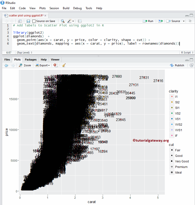
为散点图添加标签
在此示例中,我们在 ggplot2 散点图中的每个点添加了标签。
library(ggplot2)
ggplot(diamonds)  +
  geom_point(aes(x = carat,
                 y = price,
                 color = clarity,
                 shape = cut)
             ) +
  geom_text(diamonds,
            mapping = aes(x = carat, y = price),
            label = rownames(diamonds))
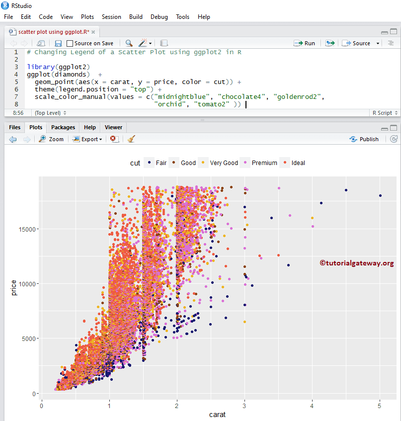
更改 R ggplot2 ggplot 散点图的图例位置
默认情况下,ggplot 将图例放置在右侧。在这里,我们将图例位置从右侧更改为顶部。请记住,您可以使用 legend.position = “none” 完全删除图例。
library(ggplot2)
ggplot(diamonds)  +
  geom_point(aes(x = carat, y = price, color = cut)) +
  theme(legend.position = "top") +
  scale_color_manual(values = c("midnightblue", "chocolat4", "goldenrod2",
                                "orchid", "tomato2"))
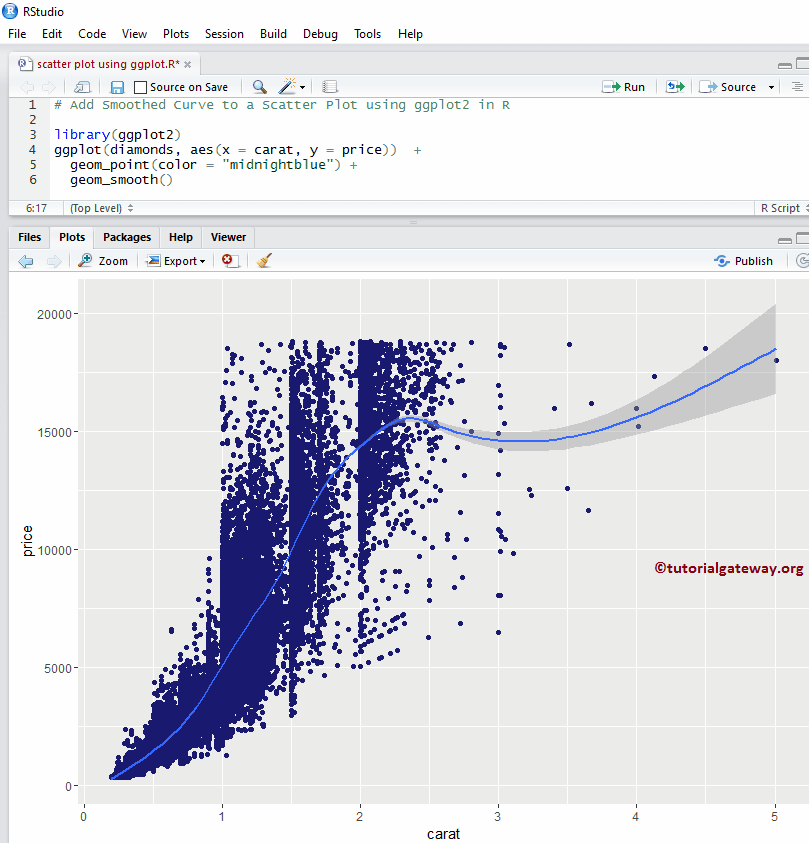
将回归线添加到 R ggplot2 ggplot 散点图
以下示例展示了如何将一个名为回归线的图层添加到该区域。它包括平滑曲线、多元回归线等。
在此示例中,我们展示了如何使用 geom_smooth() 函数将平滑曲线添加到散点图。
library(ggplot2)
ggplot(diamonds, aes(x = carat, y = price))  +
  geom_point(color = "midnightblue") +
  geom_smooth()
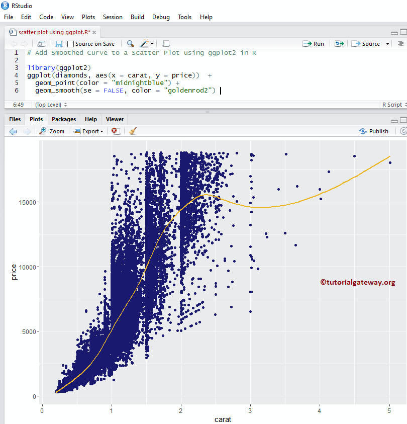
删除标准误差
默认情况下,geom_smooth() 函数会将标准误差添加到平滑曲线。让我们将其从 ggplot2 ggplot 散点图中删除。
library(ggplot2)
ggplot(diamonds, aes(x = carat, y = price))  +
  geom_point(color = "midnightblue") +
  geom_smooth(se = FALSE, color = "goldenrod2")
从上面的代码片段中,可以看到我们更改了点的默认颜色和拟合曲线的颜色。
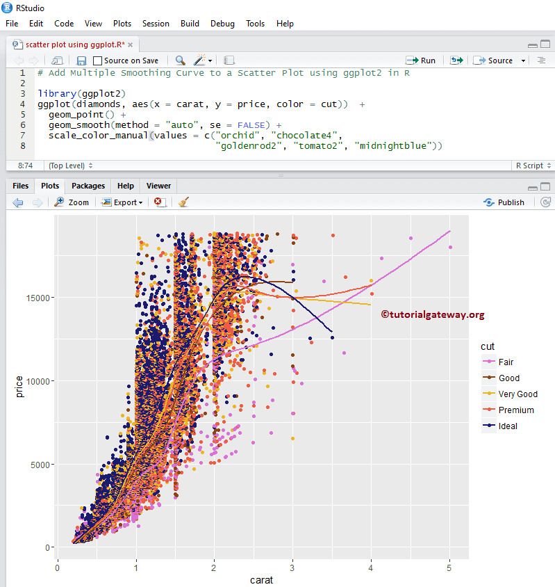
使用 ggplot2 将多个回归线添加到散点图
在此示例中,我们使用 method 参数将多个回归线添加到散点图。这里我们没有做太多,只是添加了 color 参数。这意味着 geom_smooth() 函数正在为所有不同的 diamond cuts 绘制回归线。
library(ggplot2)
ggplot(diamonds, aes(x = carat, y = price, color = cut))  +
  geom_point() +
  geom_smooth(method = "auto", se = FALSE) +
  scale_color_manual(values = c("orchid", "chocolate4",
                                "goldenrod2", "tomato2", "midnightblue"))
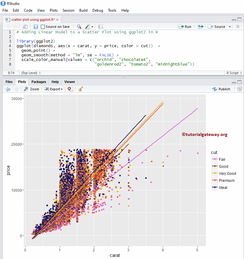
将线性模型添加到散点图
在这里,我们将线性回归添加到散点图中,将 method 参数的默认值更改为 lm(线性模型)。
library(ggplot2)
ggplot(diamonds, aes(x = carat, y = price, color = cut))  +
  geom_point() +
  geom_smooth(method = "lm", se = FALSE) +
  scale_color_manual(values = c("orchid", "chocolate4",
                                "goldenrod2", "tomato2", "midnightblue"))
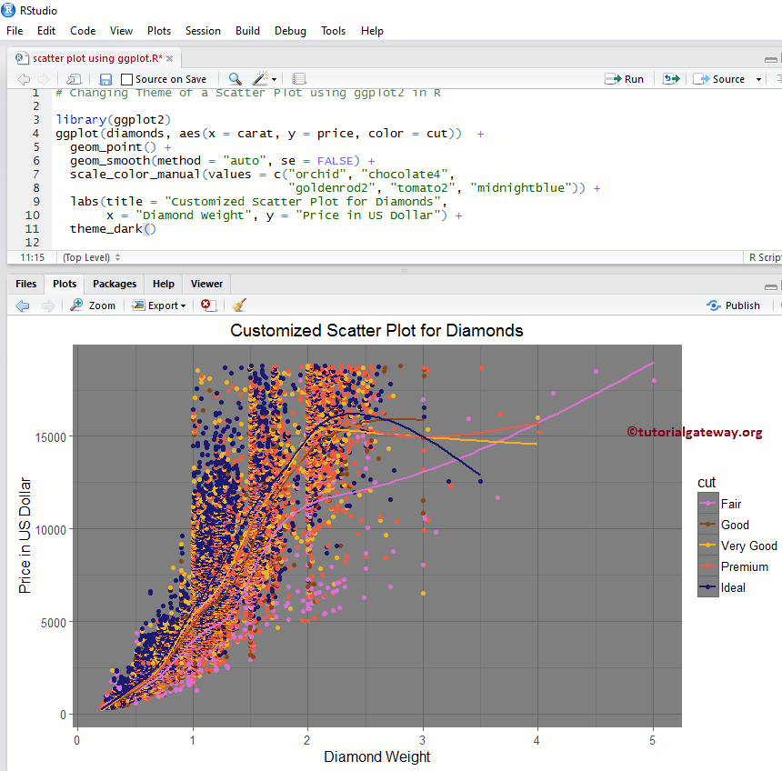
更改散点图的主题
让我们为 R ggplot2 ggplot 散点图命名,并使用 labs 函数更改 X 轴和 Y 轴的默认名称。
- theme_dark():使用此函数将默认主题更改为黑暗主题。键入 theme_ 后,R Studio 智能提示会显示可用选项。例如,theme_grey()。
- title:提供标题。
- x:请指定 X 轴的标签。
- y:指定 Y 轴的标签。
# Changing Theme

library(ggplot2)
ggplot(diamonds, aes(x = carat, y = price, color = cut))  +
  geom_point() +
  geom_smooth(method = "auto", se = FALSE) +
  scale_color_manual(values = c("orchid", "chocolate4",
                                "goldenrod2", "tomato2", "midnightblue")) +
  labs(title = "Customized Scatter Plot for Diamonds",
       x = "Diamond Weight", y = "Price in US Dollar") +
  theme_dark()
添加 2D 密度
以下示例展示了如何将 2D 密度图层添加到散点图区域。
使用 R ggplot2 ggplot 将 2D 密度添加到散点图
ggplot2 允许我们将多个图层添加到图表中。在此示例中,我们使用 geom_density_2d() 函数将 2D 密度图层添加到散点图。
# Adding Linear Model

library(ggplot2)
ggplot(diamonds, aes(x = carat, y = price))  +
  geom_point() +
  geom_density_2d()
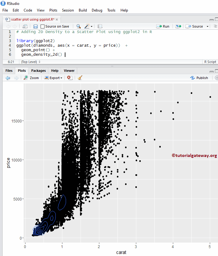
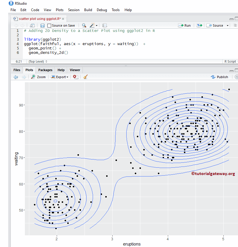
我认为 diamonds 数据集太大,无法显示 2D 密度。我将数据集更改为 faithful。
# Adding 2D Density

library(ggplot2)
ggplot(faithful, aes(x = eruptions, y = waiting))  +
  geom_point() +
  geom_density_2d()
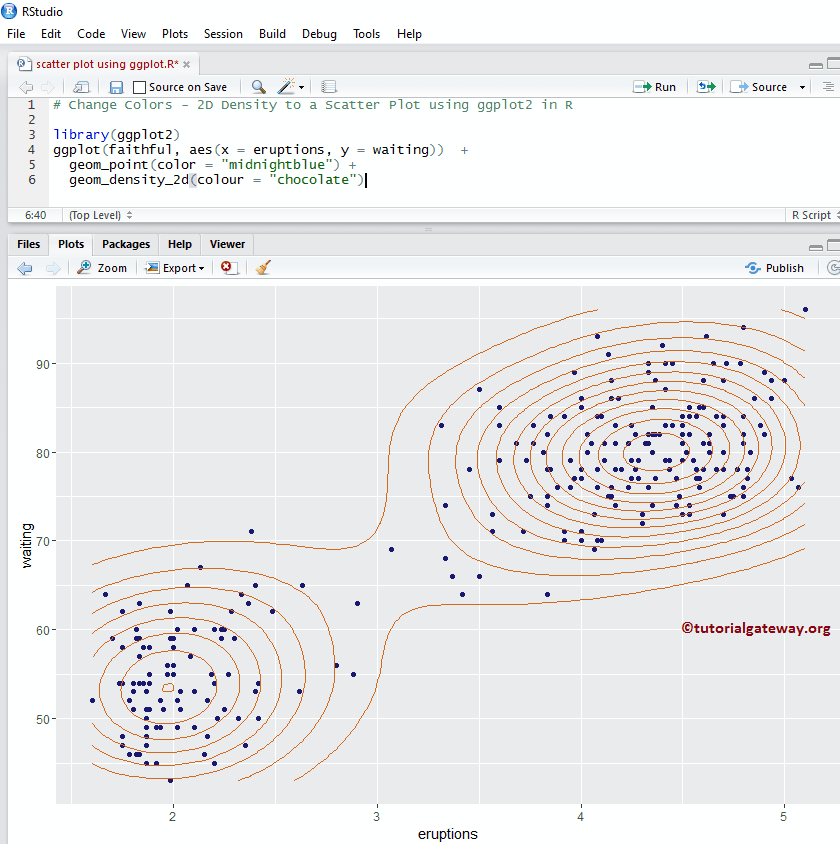
更改 2D 密度散点图的颜色
让我们使用 color 参数更改散点图和 geom_density_2d() 函数绘制的默认颜色。
# Change Colors - 2D Density

library(ggplot2)
ggplot(faithful, aes(x = eruptions, y = waiting))  +
  geom_point(color = "midnightblue") +
  geom_density_2d(colour = "chocolate")
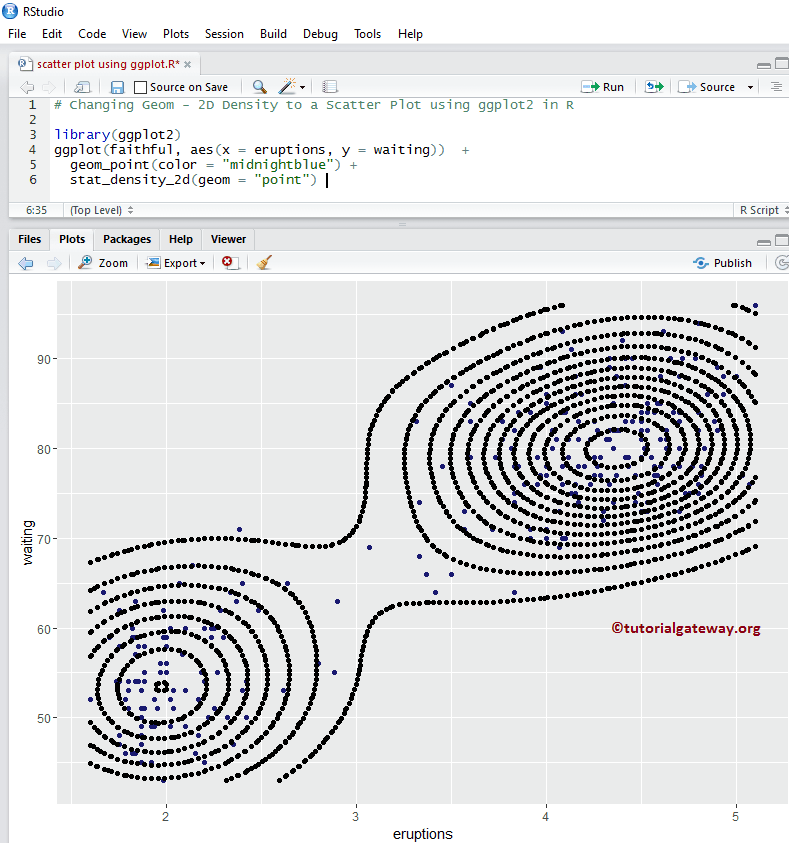
将 2D 统计密度添加到散点图
此示例展示了如何使用 stat_density_2d() 函数将 R ggplot2 ggplot 散点图中的默认线更改为点。
# Changing Geom - 2D Density

library(ggplot2)
ggplot(faithful, aes(x = eruptions, y = waiting))  +
  geom_point(color = "midnightblue") +
  stat_density_2d(geom = "point")
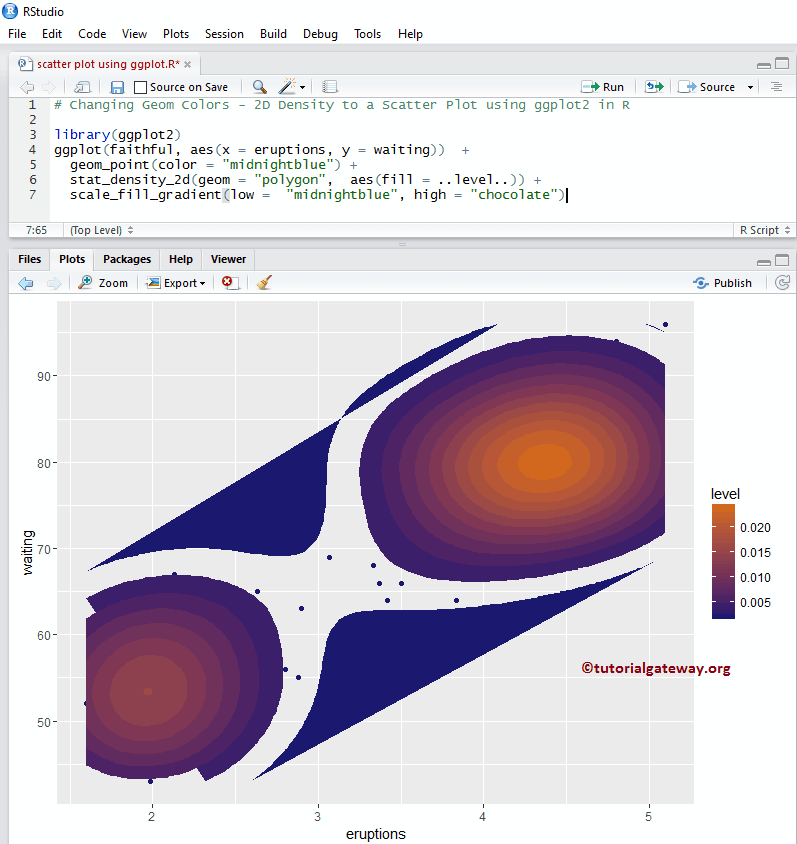
更改 ggplot 2D 统计密度散点图的颜色
让我们使用 R ggplot2 中的 scale_fill_gradient() 函数更改默认的 2D 统计密度。有许多函数,如 scale_fill_gradient2 等,所以可以尝试它们来更改外观和感觉。
# Changing Geom - 2D Density

library(ggplot2)
ggplot(faithful, aes(x = eruptions, y = waiting))  +
  geom_point(color = "midnightblue") +
  stat_density_2d(geom = "polygon",  aes(fill = ..level..)) +
  scale_fill_gradient(low =  "midnightblue", high = "chocolate")