R ggplot2 折线图或图表将 x 轴上的变量按顺序连接起来。让我们看看如何在此编程中创建 ggplot2 ggplot 折线图,格式化其颜色,并通过示例添加点。对于这个折线图,我们使用 RStudio 提供的 `economics` 数据集。
下面显示了在此编程中绘制 ggplot2 ggplot 折线图的语法。
geom_line(mapping = NULL, data = NULL, stat = "identity",
  position = "identity", inherit.aes = TRUE, na.rm = FALSE, show.legend = NA,...)
创建基本的 R ggplot2 折线图
在此示例中,我们使用 ggplot2 包创建了一个基本的折线图。为此,我们将使用 RStudio 提供的 economics 数据集。
提示:ggplot2 包默认未安装。请参阅 安装包 文章以安装所需的包。
library(ggplot2)

ggplot(economics, aes(date, pop)) +
  geom_line()
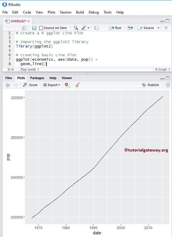
注意:如果您需要从外部文件导入数据,请参阅 R 编程中的 读取 CSV 文章以导入 CSV 文件。
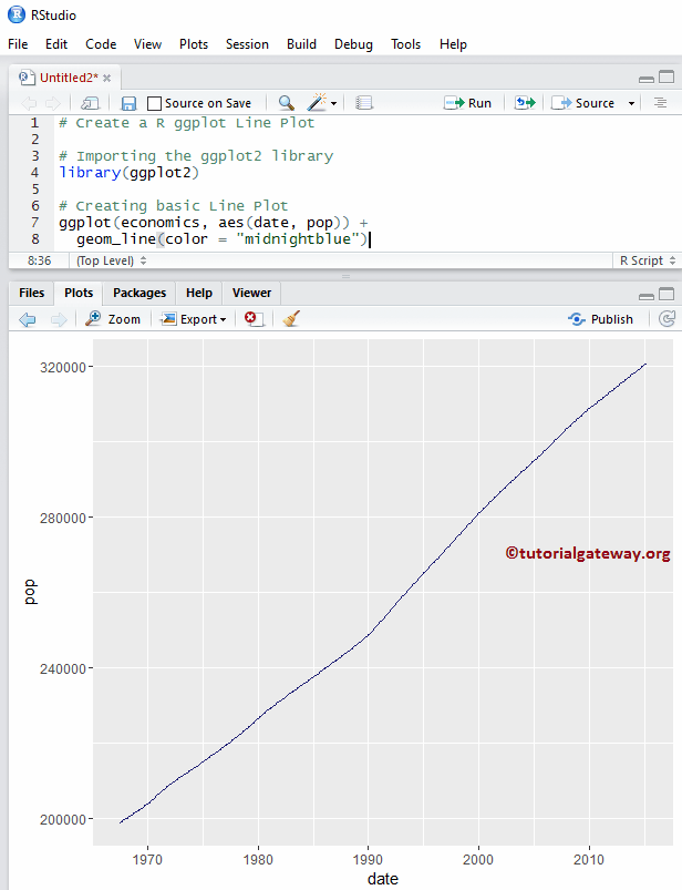
更改 R 中的折线图颜色
在此示例中,我们展示了如何使用 `color` 参数更改颜色。
library(ggplot2)

ggplot(economics, aes(date, pop)) +
  geom_line(color = "midnightblue")
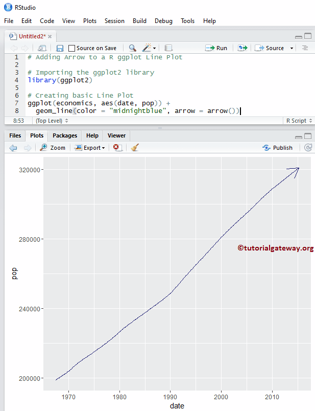
R ggplot2 折线图箭头参数
使用 `arrow` 函数在末尾添加箭头。
library(ggplot2)

ggplot(economics, aes(date, pop)) +
  geom_line(color = "midnightblue", arrow = arrow())
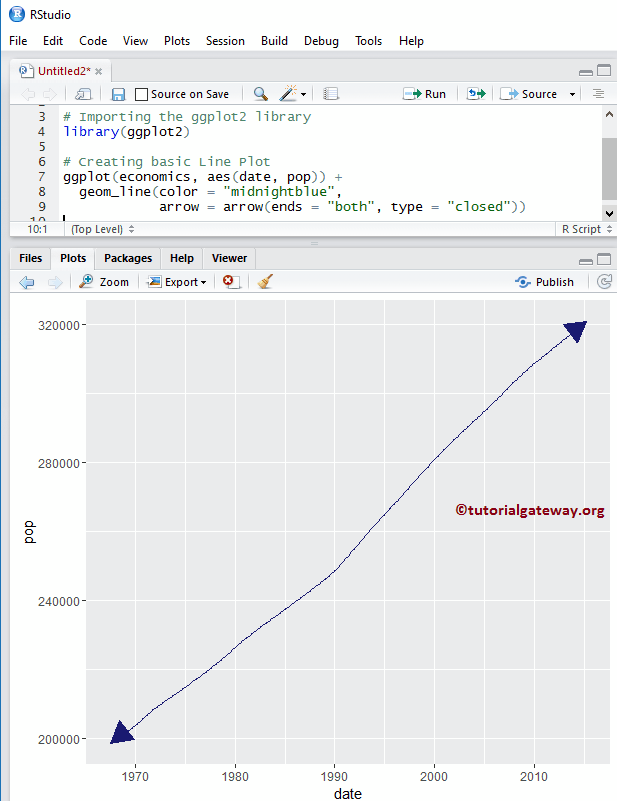
在此示例中,我们展示了如何使用 `ends` 和 `type` 参数将箭头类型更改为两侧。
library(ggplot2)

ggplot(economics, aes(date, pop)) +
  geom_line(color = "midnightblue",
            arrow = arrow(ends = "both", type = "closed"))
更改 ggplot2 折线图的类型
在此示例中,我们向您展示如何更改其类型。
library(ggplot2)

ggplot(economics, aes(date, pop)) +
  geom_line(color = "midnightblue",
            linetype = 5,
            arrow = arrow(ends = "both", type = "closed"))
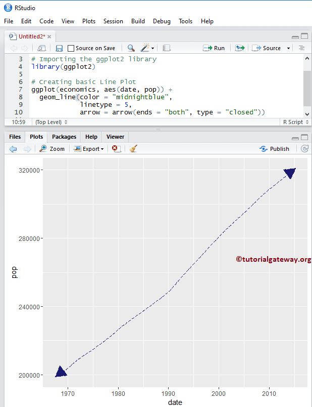
提示:在 R 编程中,0 = 空白,1 = 实线,2 = 虚线,3 = 点线,4 = 点划线,5 = 长划线,6 = 双划线。因此,您可以使用数字或字符串作为 `linetype` 值。
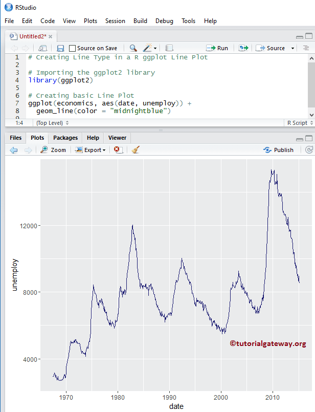
创建 R ggplot2 折线图
在此示例中,我们使用了不同的数据来创建此图,以便我们可以探索 `geom_line()` 函数中存在的更多参数。
library(ggplot2)

ggplot(economics, aes(date, unemploy)) +
  geom_line(color = "midnightblue")
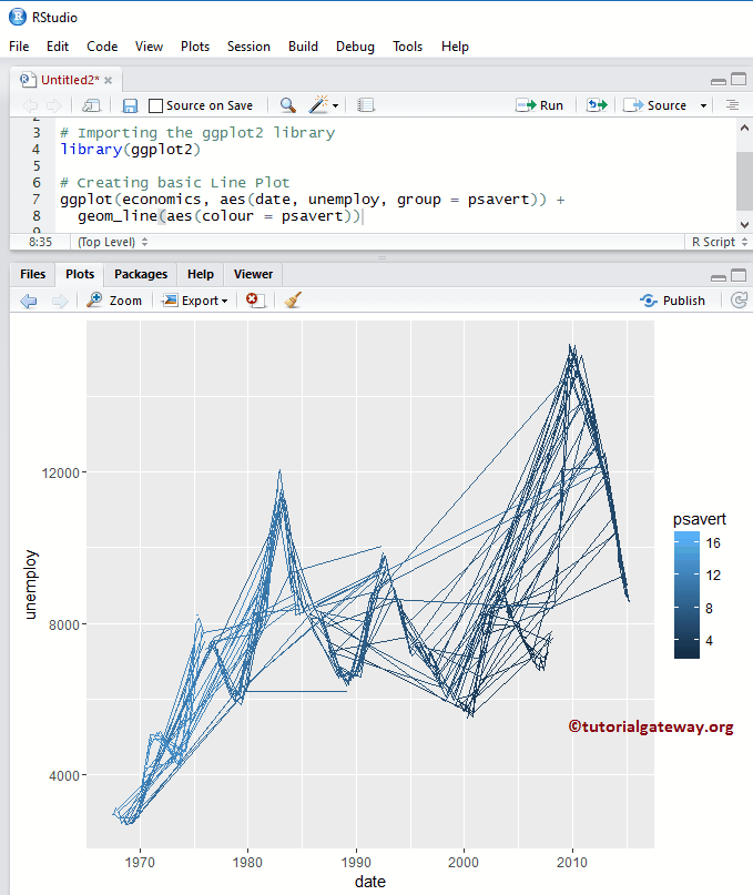
使用列数据更改折线图颜色
在此示例中,我们向您展示了如何添加组并使用列数据更改颜色。
library(ggplot2)

ggplot(economics, aes(date, unemploy, group = psavert)) +
  geom_line(aes(colour = psavert))
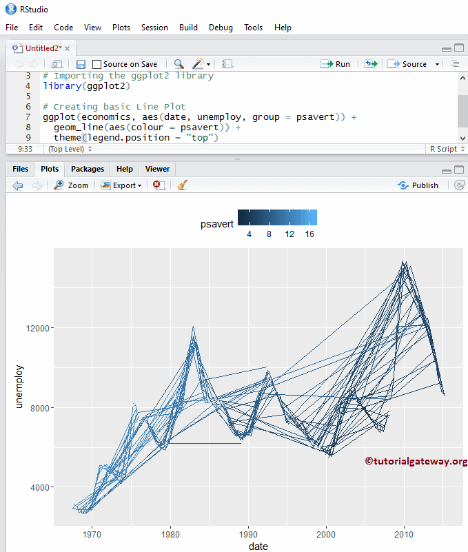
修改 R ggplot2 折线图的图例位置
默认情况下,ggplot 将图例放置在其右侧。在此示例中,我们将图例位置从右侧更改为顶部。请记住,您可以使用 `legend.position = "none"` 完全移除图例。
library(ggplot2)

ggplot(economics, aes(date, unemploy, group = psavert)) +
  geom_line(aes(colour = psavert)) +
  theme(legend.position = "top")
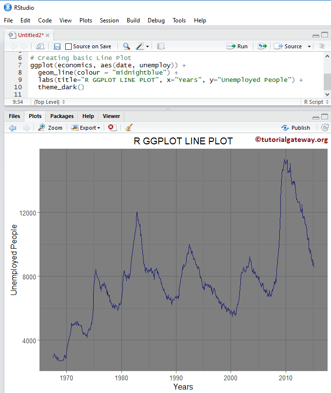
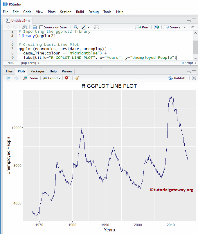
分配名称
我们使用 `labs` 函数为图表、X 轴和 Y 轴指定名称。
library(ggplot2)

ggplot(economics, aes(date, unemploy)) +
  geom_line(colour = "midnightblue") +
  labs(title="R GGPLOT LINE PLOT", x="Years", y="Unemployed People")
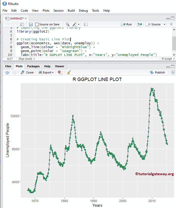
在折线图上添加点
在此 R ggplot 折线图中,我们使用 `geom_point()` 函数添加数据点。
library(ggplot2)

ggplot(economics, aes(date, unemploy)) +
  geom_line(colour = "midnightblue") +
  geom_point(color = "seagreen") +
  labs(title="R GGPLOT LINE PLOT", x="Years", y="Unemployed People")
更改主题
如何更改 ggplot2 折线图的默认主题?
- `theme_dark()`:我们使用此函数将默认主题更改为深色。如果您输入 `theme_`,则 R Studio 智能提示会显示可用选项列表。例如,`theme_grey()`。
# Importing the ggplot2 library
library(ggplot2)

# Creating basic
ggplot(economics, aes(date, unemploy)) +
  geom_line(colour = "midnightblue") +
  labs(title="R GGPLOT LINE PLOT", x="Years", y="Unemployed People") +
  theme_dark()