R ggplot2 直方图非常适合可视化可以按指定箱(中断或范围)组织起来的统计信息。尽管它看起来像条形图,但 R ggplot 直方图显示的是等间隔的数据。
让我们看看如何在 R 编程中创建 ggplot 直方图,格式化其颜色,更改其标签,并调整轴。接下来,通过示例添加密度曲线并使用 ggplot2 绘制多个直方图。
R ggplot2 直方图语法
在该编程中绘制 ggplot 直方图的语法是
geom_histogram(data = NULL, binwidth = NULL, bins = NULL)
而 ggplot2 直方图背后的复杂语法是
geom_histogram(mapping = NULL, data = NULL, stat = "bin",
               binwidth = NULL, bins = NULL, position = "stack", ...,
               na.rm = FALSE, show.legend = NA, inherit.aes = TRUE)
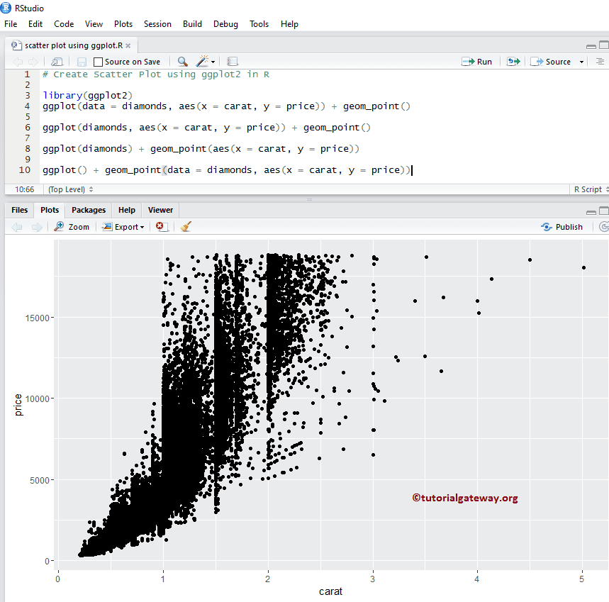
在开始 ggplot 直方图示例之前,让我们先看看我们将用于此示例的数据。本次演示,我们将使用 R 提供的 diamonds 数据集,该数据集中的数据是
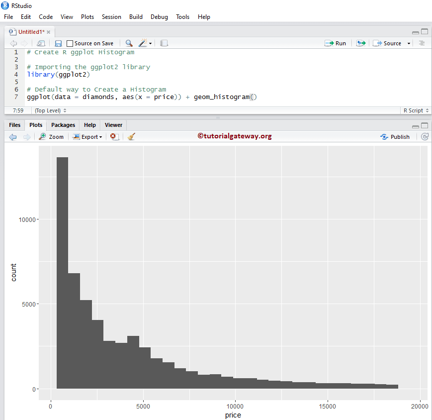
创建 R ggplot2 直方图
此示例显示如何使用 ggplot2 包创建它。本次演示,我们将使用上面所示的 R Studio 提供的 diamonds 数据集。
提示:ggplot2 包默认未安装。请参阅安装 R 包文章,在R 编程中安装该包。
# Importing the ggplot2 library
library(ggplot2)

ggplot(data = diamonds, aes(x = price)) + geom_histogram()
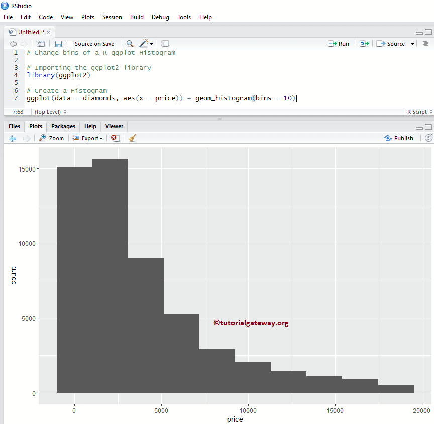
更改 R ggplot2 直方图的箱
在此示例中,我们展示了如何在 R ggplot 直方图中更改箱的数量(范围或中断)。默认情况下,geom_histogram() 提供 30 个箱,但您可以根据需要修改该值。
注意:如果您需要从外部文件导入数据,请参阅R 读取 CSV文章以导入 CSV 文件。
library(ggplot2)

# Default way to Create
ggplot(data = diamonds, aes(x = price)) + geom_histogram(bins = 10)
更改箱宽
此示例展示了如何在 R ggplot 直方图中更改箱宽(覆盖箱)的数量。
library(ggplot2)

ggplot(data = diamonds, aes(x = price)) + geom_histogram(binwidth = 10)
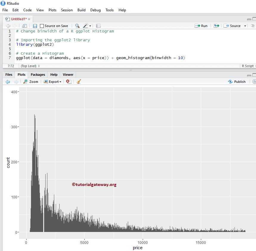
提示:使用 bandwidth = 2000 可以获得与 bins = 10 相同的一个。
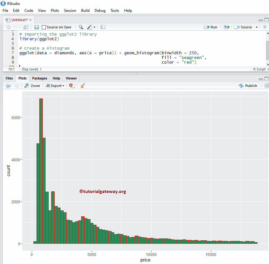
更改 R ggplot2 直方图的颜色
在此示例中,我们更改了由 ggplot2 绘制的颜色。
- color:请指定用于条形边框的颜色。例如,“red”、“blue”、“green”等。在此示例中,我们将边框指定为“red”颜色。
- fill:您需要指定条形的颜色。在此示例中,我们指定了海绿色。
library(ggplot2)

ggplot(data = diamonds, aes(x = price)) + geom_histogram(binwidth = 250,
                                                         fill = "seagreen",
                                                         color = "red")
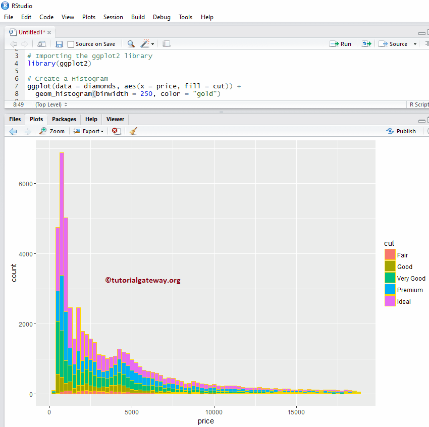
更改颜色示例 2
让我们看看如何根据列数据更改 ggplot2 直方图的颜色。在此示例中,我们将 cut 列指定为 fill 属性。您可以尝试将其更改为任何其他列。
library(ggplot2)

ggplot(data = diamonds, aes(x = price, fill = cut)) +
        geom_histogram(binwidth = 250, color = "red")
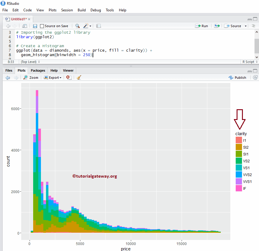
更改颜色示例 3
在此示例中,我们将 fill 属性更改为 clarity,并移除了 r ggplot 直方图中每个条形的边框。
library(ggplot2)

ggplot(data = diamonds, aes(x = price, fill = clarity)) +
  geom_histogram(binwidth = 250)
更改 R ggplot2 直方图的线型
在此示例中,我们更改了 ggplot 直方图中每个条形的边框线。
library(ggplot2)

ggplot(data = diamonds, aes(x = price, fill = clarity)) +
  geom_histogram(binwidth = 250, color = "midnightblue", linetype = "longdash")

提示:在 R 编程中,0 = 无、1 = 实线、2 = 虚线、3 = 点线、4 = 点划线、5 = 长虚线、6 = 双虚线。因此,请使用数字或字符串
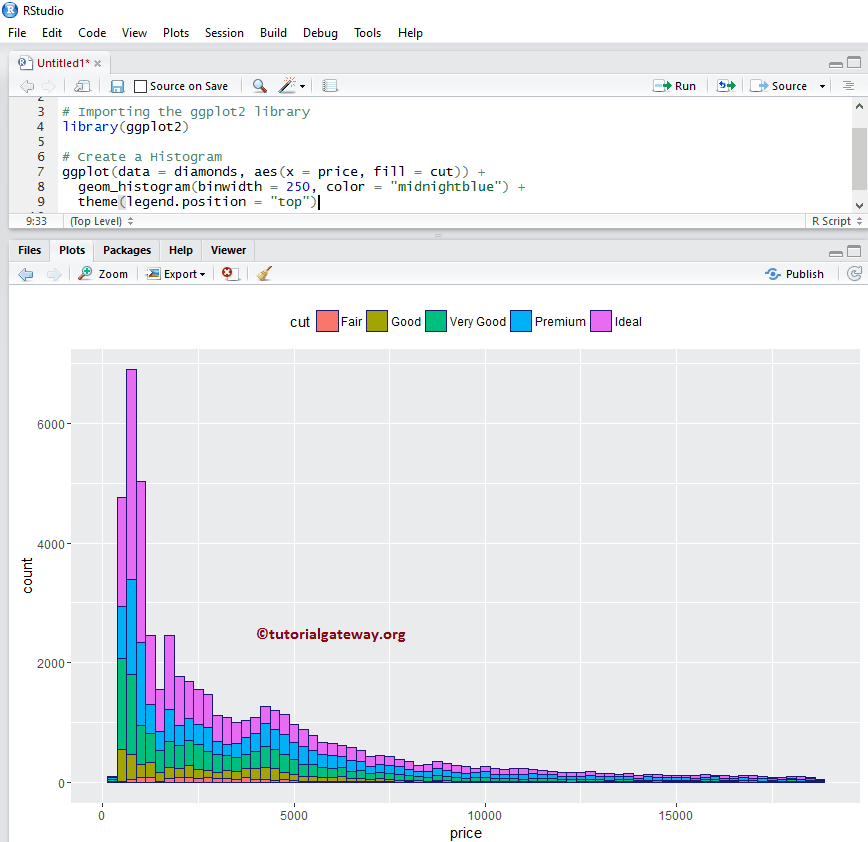
更改直方图的图例位置
默认情况下,r ggplot 将图例放置在其右侧。在此示例中,我们将图例位置从右侧更改为顶部。请记住,您可以使用 legend.position = “none” 完全删除图例。
library(ggplot2)

ggplot(data = diamonds, aes(x = price, fill = cut)) +
  geom_histogram(binwidth = 250, color = "midnightblue") +
  theme(legend.position = "top")
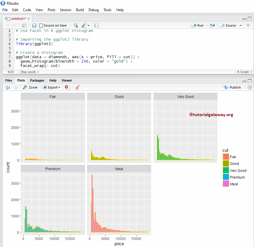
如何在 R ggplot2 直方图中使用分面
此示例通过根据列值分割数据,在 ggplot 中绘制多个直方图。
library(ggplot2)

ggplot(data = diamonds, aes(x = price, fill = cut)) +
  geom_histogram(binwidth = 250, color = "gold") +
  facet_wrap(~ cut) # divide the histogram, based on Cut
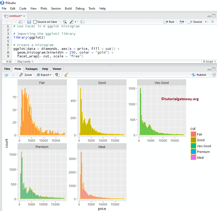
如何在 ggplot2 直方图示例 2 中使用分面
默认情况下,facet_wrap() 为所有分面分配相同的 y 轴。但是,您可以通过添加另一个名为 scale 的属性来更改它(为每个分面提供独立的轴)。
library(ggplot2)

ggplot(data = diamonds, aes(x = price, fill = cut)) +
  geom_histogram(binwidth = 250, color = "gold") +
  facet_wrap(~ cut, scale = "free")
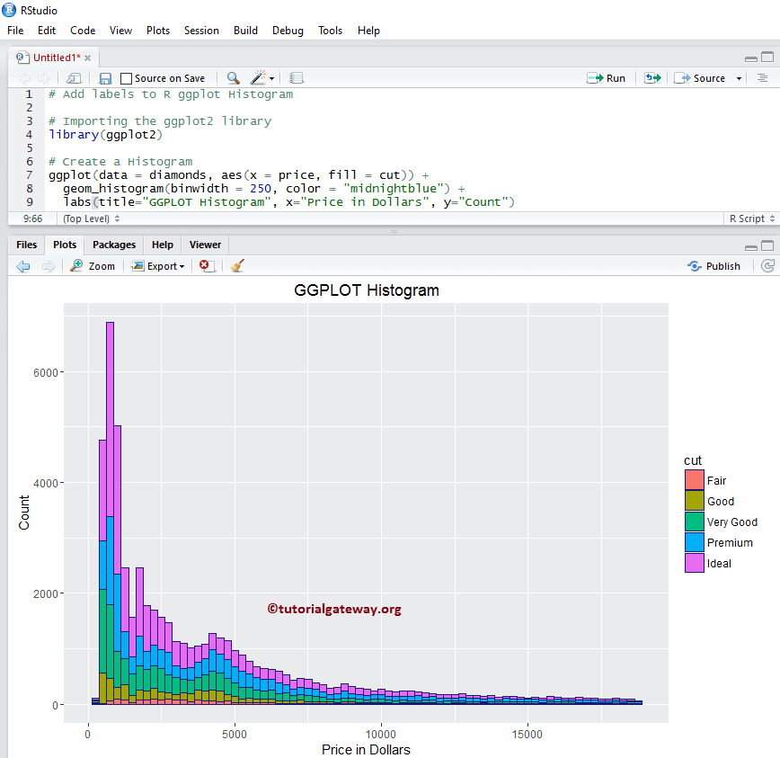
为 R ggplot 直方图指定名称
让我们使用 labs 函数为 ggplot2 直方图、X 轴和 Y 轴指定名称。
library(ggplot2)

ggplot(data = diamonds, aes(x = price, fill = cut)) +
  geom_histogram(binwidth = 250, color = "midnightblue") +
  labs(title="GGPLOT Histogram", x="Price in Dollars", y="Count")
# Or you can add labs one more time to add X, Y axis names
+ labs(x="Price in Dollars", y="Count")
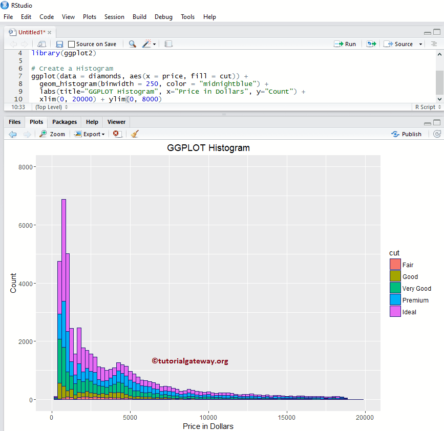
更改直方图的轴限制
让我们在 r 中的 ggplot 直方图中更改默认轴值
- xlim:此参数可以帮助您指定X轴的限制。
- ylim:它有助于指定 Y 轴限制。在此示例中,我们将默认 x 轴限制更改为 (0, 20000),将 y 轴限制更改为 (0, 8000)
library(ggplot2)

ggplot(data = diamonds, aes(x = price, fill = cut)) +
  geom_histogram(binwidth = 250, color = "midnightblue") +
  labs(title="GGPLOT Histogram", x="Price in Dollars", y="Count") +
  xlim(0, 20000) + ylim(0, 8000)
创建具有密度的直方图
频率计数并给出每个箱中的数据点数量。在实际应用中,我们可能更关注密度而不是基于频率的,因为密度可以给出概率密度。让我们看看如何使用 geom_density() 在 r 中创建针对密度的 ggplot 直方图。
library(ggplot2)

ggplot(data = diamonds, aes(x = price)) +
  geom_histogram(binwidth = 250, aes(y=..density..),
                 fill = "seagreen", color = "midnightblue") +
  geom_density(color = "red") +
  labs(title="GGPLOT Histogram", x="Price in Dollars", y="Count")

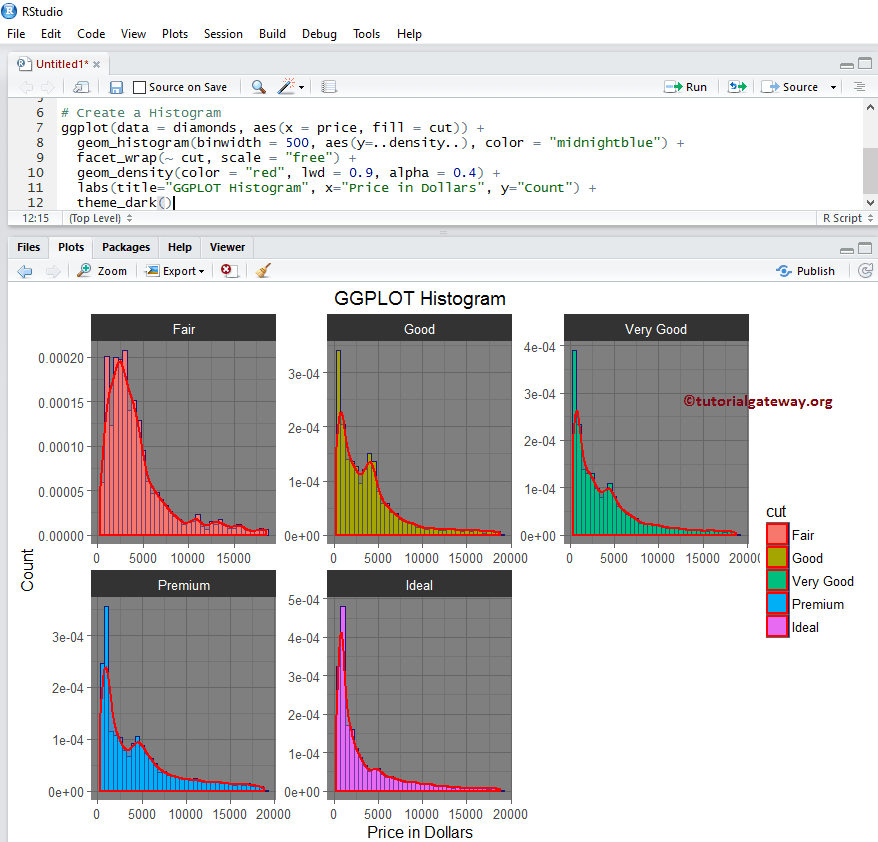
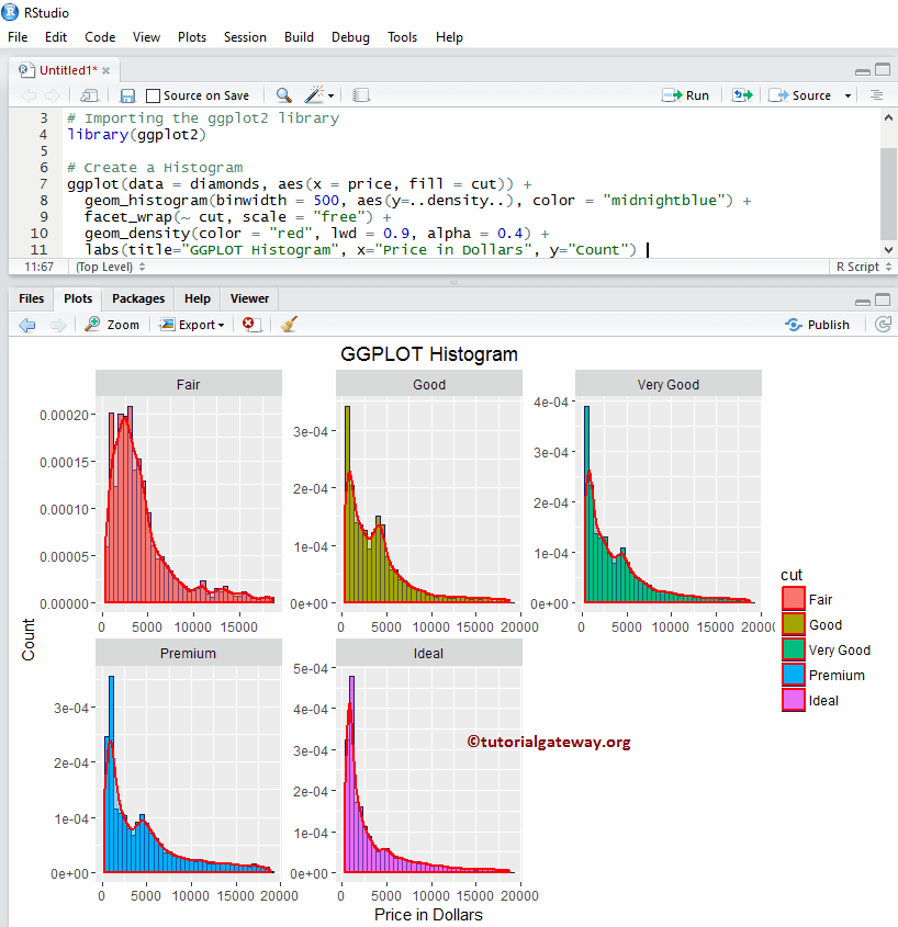
如何使用分面与密度
在此示例中,我们将密度线绘制到由 ggplot2 在 r 中绘制的多个直方图上。
library(ggplot2)

ggplot(data = diamonds, aes(x = price, fill = cut)) +
  geom_histogram(binwidth = 500, aes(y=..density..), color = "midnightblue") +
  facet_wrap(~ cut, scale = "free") +
  geom_density(color = "red", lwd = 0.9, alpha = 0.4) +
  labs(title="GGPLOT Histogram", x="Price in Dollars", y="Count")
更改主题
让我们看看如何更改 ggplot2 直方图的默认主题
- theme_dark(): 我们使用此函数将默认主题更改为暗色。键入 theme_,然后R Studio 智能提示会显示可用选项列表。例如,theme_grey()
library(ggplot2)

ggplot(data = diamonds, aes(x = price, fill = cut)) +
  geom_histogram(binwidth = 500, aes(y=..density..), color = "midnightblue") +
  facet_wrap(~ cut, scale = "free") +
  geom_density(color = "red", lwd = 0.9, alpha = 0.4) +
  labs(title="GGPLOT Histogram", x="Price in Dollars", y="Count") +
  theme_dark()