R ggplot2 点图(dot plot)或点状图是由绘制在指定刻度上的数据点组成的。我将演示如何创建 R ggplot 点图、设置其颜色格式,并通过示例绘制水平点图。
在此 ggplot2 点图演示中,我们使用 studio 提供的 `airquality` 数据集。在此编程中绘制点图的语法是:
geom_dotplot(binaxis = "x", mapping = NULL, data = NULL,
  position = "identity", ..., method = "dotdensity",binwidth = NULL,
  stackratio = 1, binpositions = "bygroup", stackdir = "up", right = TRUE,
  stackgroups = FALSE, dotsize = 1, show.legend = NA, origin = NULL,
  width = 0.9, na.rm = FALSE, inherit.aes = TRUE, drop = FALSE)
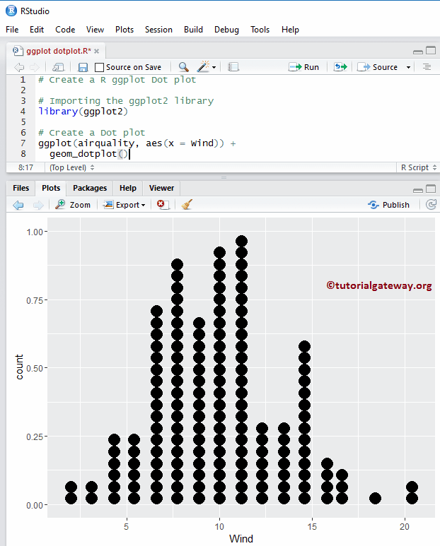
创建基本的 R ggplot2 点图
在本例中,我们将展示如何使用 `ggplot2` 包创建基本点图。为此,我们将使用 R Studio 提供的 `airquality` 数据集。
提示:`ggplot2` 包默认不安装。请参考 安装 R 包 文章,了解如何在 R 编程 中安装包。
# Create a ggplot Dot plot

# Importing the ggplot2 library
library(ggplot2)

# Create a Violin plot
ggplot(airquality, aes(x = Wind)) +
  geom_dotplot()
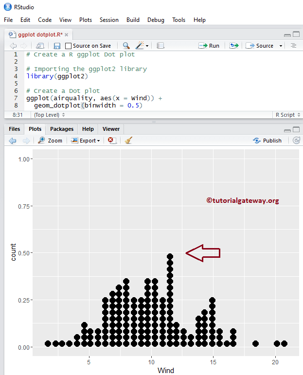
更改 R ggplot2 点图的 binwidth
在此 R ggplot 点图示例中,我们将展示如何使用 `binwidth` 参数更改点图的 bin 宽度。
binwidth
- 当 `method = “dotdensity”`(默认值)时,`binwidth` 指定最大 bin 宽度。
- 当 `method = “histodot”` 时,`binwidth` 指定 bin 宽度。
注意:如果您需要从外部文件导入数据,请参考 R 读取 CSV 文章来导入 CSV 文件。
# Change the binwidth of an R ggplot Dot plot

# Importing the ggplot2 library
library(ggplot2)

# Create a Dot plot
ggplot(airquality, aes(x = Wind)) +
  geom_dotplot(binwidth = 0.5)
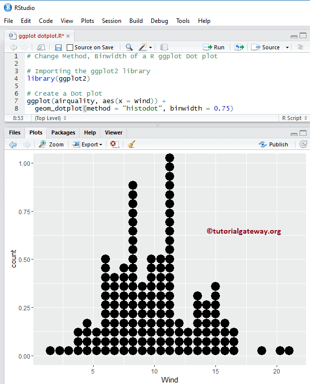
更改 ggplot2 点图的方法
在此 R ggplot 点图示例中,我们将展示如何使用 `method` 参数更改点图的方法。
- method:默认值为 `dotdensity`,但您可以将其更改为 `histodot` 以获得固定 bin 宽度。
# Change Method, Binwidth of the ggplot Dot plot

# Importing the ggplot2 library
library(ggplot2)

# Create a Dot plot
ggplot(airquality, aes(x = Wind)) +
  geom_dotplot(method = "histodot", binwidth = 0.75)
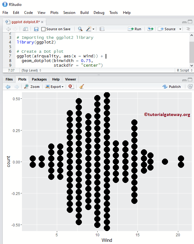
更改 R ggplot2 点图的堆叠方向
在此 ggplot 点图示例中,我们将使用 `stackdir` 参数更改点图中的点堆叠方向。
- stackdir:默认值为 `up`(表示点向上堆叠),但您可以将其更改为 `down`、`center` 和 `centerwhole`。
# Change Stack Direction

# Importing the ggplot2 library
library(ggplot2)

# Create a Dot plot
ggplot(airquality, aes(x = Wind)) +
  geom_dotplot(binwidth = 0.75,
               stackdir = "center")
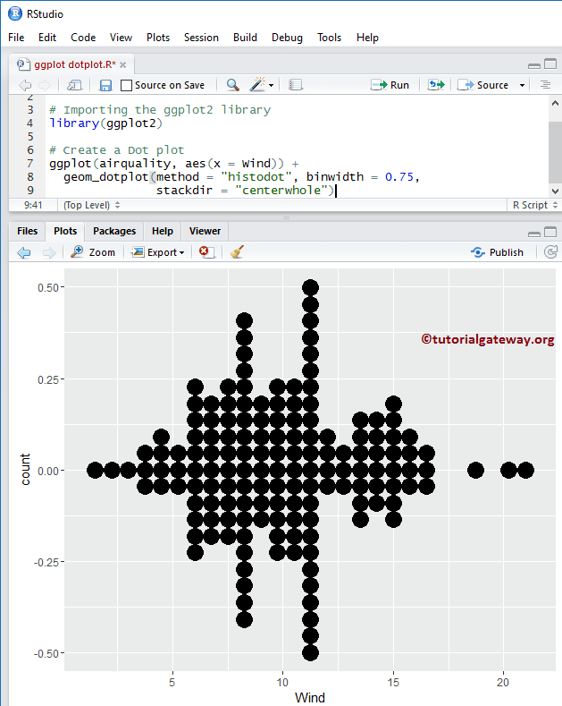
更改 ggplot2 点图的堆叠方向 2
在此,我们将堆叠方向值从 `center` 更改为 `centerwhole`。
# Change Stack Direction of an ggplot Dot plot

# Importing the ggplot2 library
library(ggplot2)

# Create a Dot plot
ggplot(airquality, aes(x = Wind)) +
  geom_dotplot(method = "histodot", binwidth = 0.75,
               stackdir = "centerwhole")
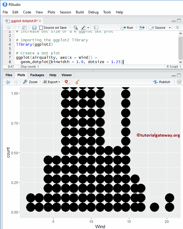
调整 R ggplot2 点图的点大小
在此示例中,我们将使用 `dotsize` 参数更改 R ggplot 点图中的点大小。
# Increase Dot Size of a ggplot Dot plot

# Importing the ggplot2 library
library(ggplot2)

# Create a Dot plot
ggplot(airquality, aes(x = Wind)) +
  geom_dotplot(binwidth = 1.0, dotsize = 1.25)
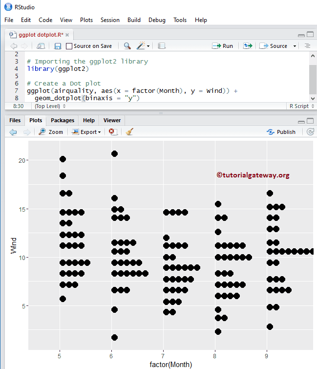
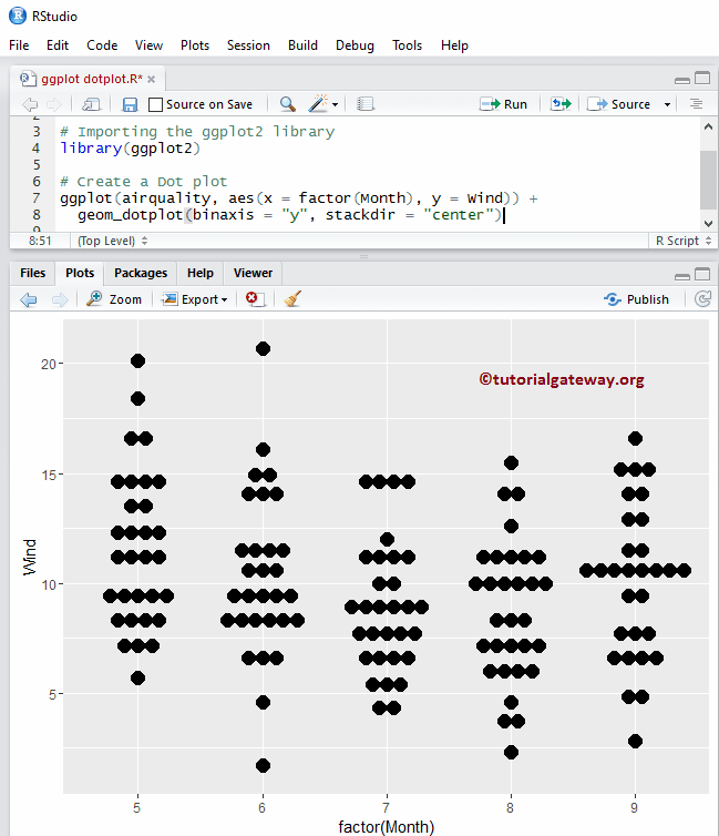
ggplot2 点图在 y 轴上堆叠
在此示例中,我们将堆叠轴更改为 y 轴。
# ggplot Dot plot - Stacking on the Y-Axis

# Importing the ggplot2 library
library(ggplot2)

# Create a Dot plot
ggplot(airquality, aes(x = factor(Month), y = Wind)) +
  geom_dotplot(binaxis = "y")
R ggplot2 点图在 y 轴上堆叠 2
在此示例中,我们正在更改堆叠方向。
# ggplot Dot plot - Stacking on Y-Axis

# Importing the ggplot2 library
library(ggplot2)

# Create a Dot plot
ggplot(airquality, aes(x = factor(Month), y = Wind)) +
  geom_dotplot(binaxis = "y", stackdir = "center")
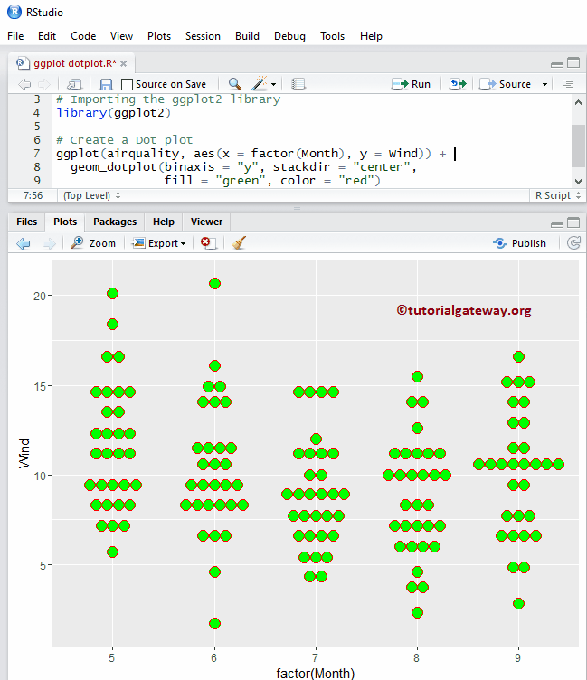
更改 R 中点图的颜色
让我们使用 `fill` 参数更改点图的颜色。
- fill:请指定您想为点图使用的颜色。在您的控制台中输入 `colors()` 以获取 R 编程中可用颜色的列表。
- color:为点的边框指定颜色。
# Change Colors of an ggplot Dot plot

# Importing the ggplot2 library
library(ggplot2)

# Create a Dot plot
ggplot(airquality, aes(x = factor(Month), y = Wind)) +
  geom_dotplot(binaxis = "y", stackdir = "center",
               fill = "green", color = "red")
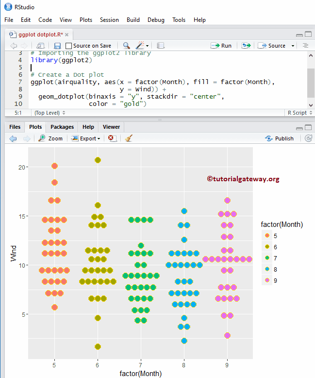
使用列更改 R 点图的颜色
让我们看看如何使用列数据更改点图的颜色。在此,我们使用 `Month` 列数据来区分颜色。
# Change Colors of an ggplot Dot plot

# Importing the ggplot2 library
library(ggplot2)

# Create a Dot plot
ggplot(airquality, aes(x = factor(Month), fill = factor(Month),
                       y = Wind)) +
  geom_dotplot(binaxis = "y", stackdir = "center",
               color = "gold")
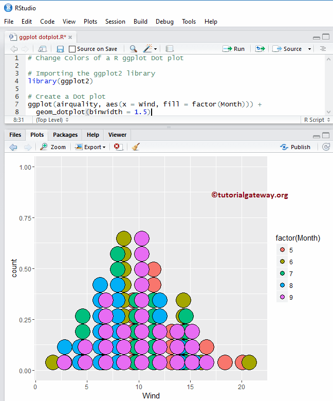
使用列更改 R 点图的颜色 2
在此,我们移除了 `R ggplot dotplot` 的 y 轴。
# Change Colors of an ggplot Dot plot

# Importing the ggplot2 library
library(ggplot2)

# Create a Dot plot
ggplot(airquality, aes(x = Wind, fill = factor(Month))) +
  geom_dotplot(binwidth = 1.5)
R ggplot2 点图中的多个分组
在此 R ggplot 点图示例中,我们将展示如何对多个点图进行分组。
- stackgroups:请指定您是否希望按组堆叠点。
- binpositions:当 `method` 为 “dotdensity” 时,
- 并且 `binpositions = “bygroup”` 会为每个组单独决定 bin 的位置。
- `binpositions = “all”` 通过将所有数据放在一起决定 bin 的位置。因此,我们可以使用它来对齐多个组中的点。
# Multiple Groups in ggplot Dot plot

# Importing the ggplot2 library
library(ggplot2)

# Create a Dot plot
ggplot(airquality, aes(x = Wind, fill = factor(Month))) +
  geom_dotplot(binwidth = 1.0, stackgroups = TRUE, binpositions="all")
ggplot2 点图中的多个分组 2
在此 R ggplot 点图示例中,我们从 `geom_dotplot()` 函数中移除了 `binpositions` 参数。我们将 `histodot` 值添加到了 `method` 参数中。
# Multiple Groups in ggplot Dot plot

# Importing the ggplot2 library
library(ggplot2)

# Create a Dot plot
ggplot(airquality, aes(x = Wind, fill = factor(Month))) +
  geom_dotplot(method = "histodot", binwidth = 0.75, stackgroups = TRUE)
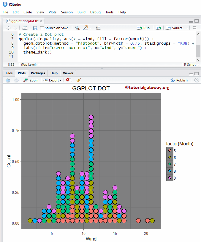
为 R ggplot 点图分配名称
在此 ggplot 点图示例中,我们使用 `labs` 函数为 ggplot 点图、X 轴和 Y 轴分配名称,并更改 ggplot 点图的默认主题。
- theme_dark():我们使用此函数将点图的默认主题更改为暗色。如果您输入 `theme_`,则 R Studio 的智能提示会显示可用选项列表。例如,`theme_grey()`。
# Multiple Groups in ggplot Dot plot

# Importing the ggplot2 library
library(ggplot2)

# Create a Dot plot
ggplot(airquality, aes(x = Wind, fill = factor(Month))) +
  geom_dotplot(method = "histodot", binwidth = 0.75, stackgroups = TRUE) +
  labs(title="GGPLOT DOT PLOT", x="Wind", y="Count") +
  theme_dark()