R ggplot2 密度图有助于可视化具有底层平滑性的变量分布。让我们看看如何使用 R ggplot2 和一个示例来创建 ggplot 密度图、格式化颜色、修改轴、更改标签、添加直方图以及绘制多个密度图。
R ggplot 密度图语法
在 R 编程中绘制 ggplot 密度图的语法如下所示
geom_density(mapping = NULL, data = NULL, stat = "density",
             position = "identity", na.rm = FALSE, ..., show.legend = NA,
             inherit.aes = TRUE)
在深入 ggplot2 示例之前,让我们看看我们将用于此密度图示例的数据。在本演示中,我们将使用 R 提供的 diamonds 数据集,该数据集中的数据是
创建 R ggplot2 密度图
在此示例中,我们将向您展示如何使用 ggplot2 包创建密度图,并且我们将使用 RStudio 提供的上述 diamonds 数据集。
提示:ggplot2 包默认未安装。请参阅安装 R 包文章以了解在R 编程中安装包所涉及的步骤。
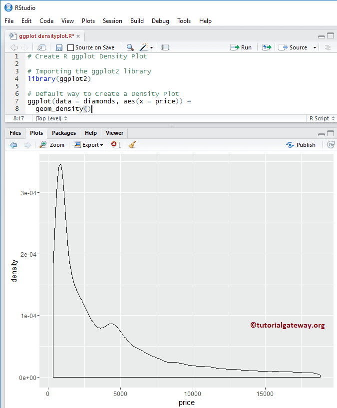
library(ggplot2)

# Default way
ggplot(data = diamonds, aes(x = price)) +
  geom_density()
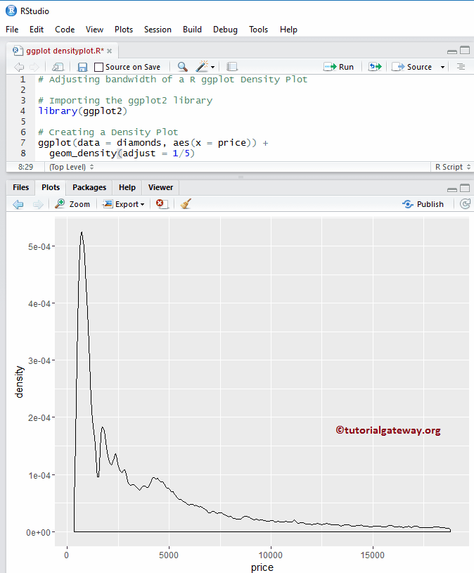
调整带宽
让我们看看如何使用 adjust 参数在密度图中更改带宽。
注意:如果您的要求是从外部文件导入数据,请参阅R 读取 CSV文章以了解 CSV 文件导入所涉及的步骤。
library(ggplot2)

ggplot(data = diamonds, aes(x = price)) +
  geom_density(adjust = 1/5)
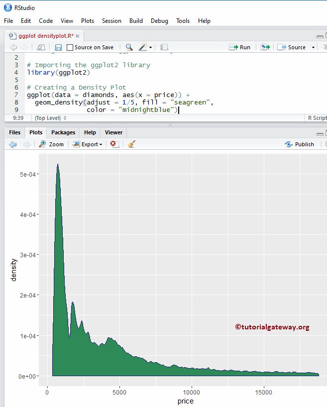
更改 R ggplot2 密度图的颜色
在此示例中,我们将展示如何更改 ggplot2 绘制的密度图的颜色。
- color:请指定您要用于密度曲线边框的颜色。例如,“red”、“blue”、“green”等。在此示例中,我们将边框指定为“午夜蓝”颜色。
- fill:您必须指定要填充/使用的颜色。在此示例中,我们指定了海绿色。
library(ggplot2)

ggplot(data = diamonds, aes(x = price)) +
  geom_density(adjust = 1/5, fill = "seagreen",
               color = "midnightblue")
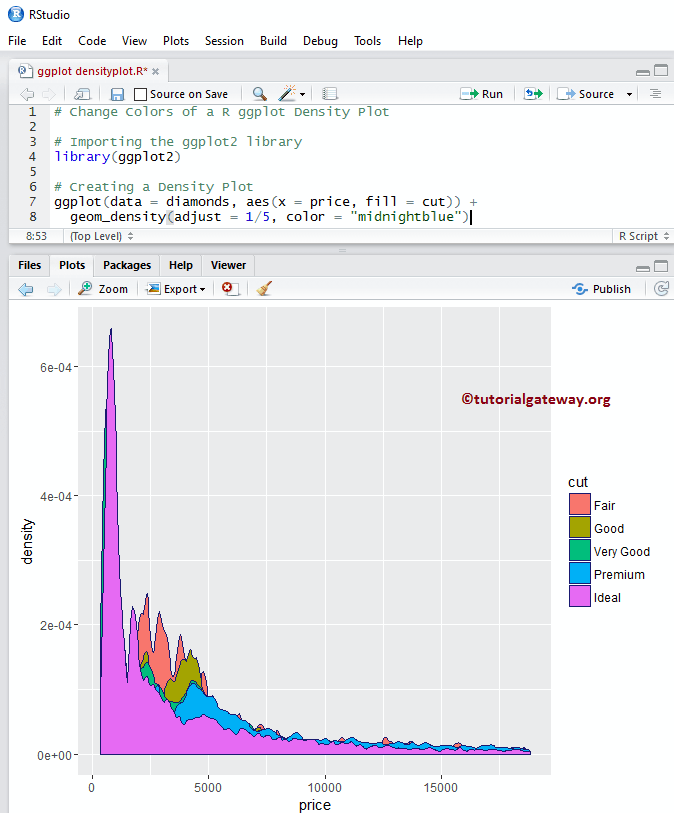
更改 R ggplot2 密度图颜色示例 2
让我们看看如何根据列数据填充 ggplot2 密度图的颜色。在此示例中,我们将 cut 列指定为填充属性。您可以尝试将其更改为任何其他列。
library(ggplot2)

ggplot(data = diamonds, aes(x = price, fill = cut)) +
  geom_density(adjust = 1/5, color = "midnightblue")
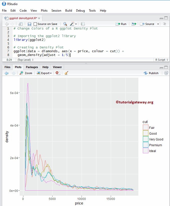
颜色示例 3
让我们看看如何根据列数据更改 ggplot2 密度图线的颜色。在此示例中,我们将 cut 列指定为颜色属性。您可以尝试将其更改为任何其他列。
library(ggplot2)

ggplot(data = diamonds, aes(x = price, colour = cut)) +
  geom_density(adjust = 1/5)
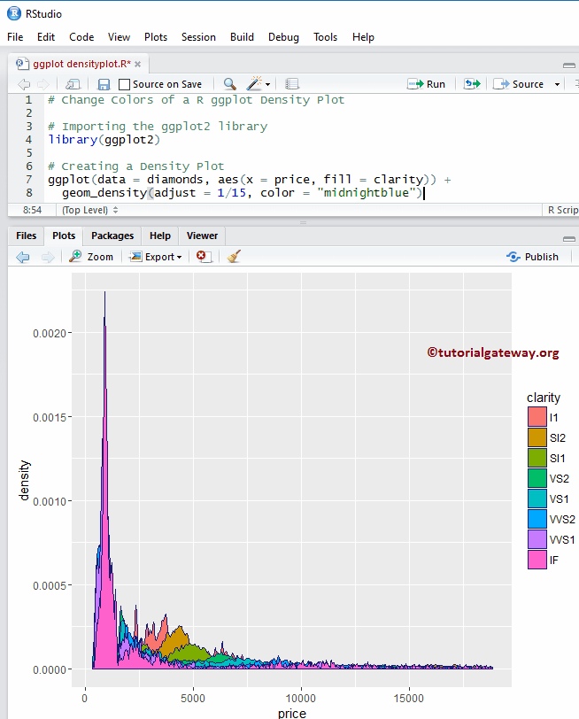
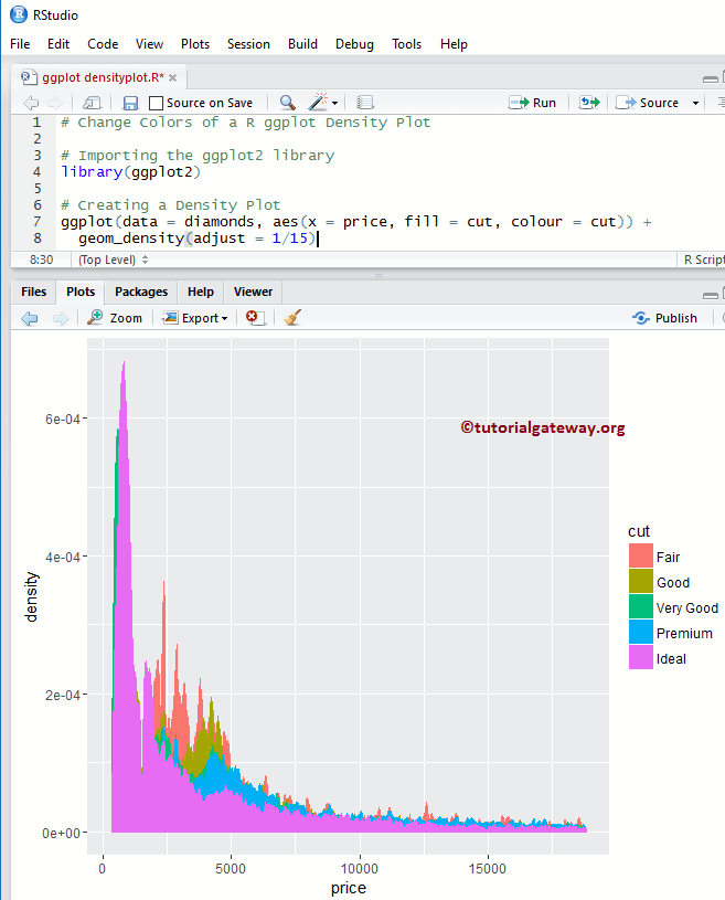
颜色示例 4
在此示例中,我们将 clarity 属性更改为 fill。
library(ggplot2)

ggplot(data = diamonds, aes(x = price, fill = clarity)) +
  geom_density(adjust = 1/15, color = "midnightblue")
更改 R ggplot2 密度图颜色示例 5
在此示例中,我们将 fill 属性更改为 cut,将 color 属性更改为 cut。
library(ggplot2)

ggplot(data = diamonds, aes(x = price, fill = cut, colour = cut)) +
  geom_density(adjust = 1/15)
更改 R ggplot2 密度图的线型
让我们看看如何更改边框线。
library(ggplot2)

ggplot(data = diamonds, aes(x = price, fill = clarity)) +
  geom_density(adjust = 1/5, color = "midnightblue", linetype = 5)
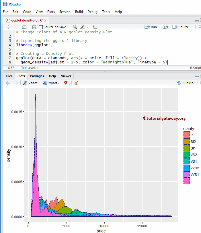
提示:在 R 编程中,0 = blank(空白),1 = solid(实线),2 = dashed(虚线),3 = dotted(点线),4 = dotdash(点划线),5 = longdash(长虚线),6 = twodash(双虚线)。因此,您可以使用数字或字符串作为 line type 值。
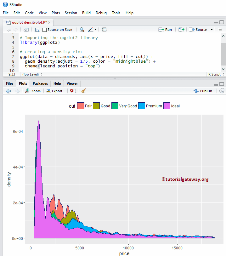
更改图例位置
默认情况下,ggplot 将图例放置在右侧。让我们将图例位置从右侧更改为顶部。请记住,您可以使用 legend.position = “none” 完全删除图例。
library(ggplot2)

ggplot(data = diamonds, aes(x = price, fill = cut)) +
  geom_density(adjust = 1/5, color = "midnightblue") +
  theme(legend.position = "top")
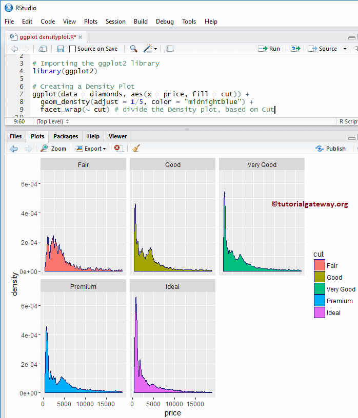
多个 R ggplot 密度图
我将展示如何通过按列值拆分数据来绘制多个密度图。
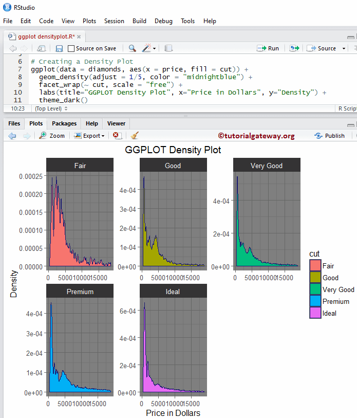
library(ggplot2)

ggplot(data = diamonds, aes(x = price, fill = cut)) +
  geom_density(adjust = 1/5, color = "midnightblue") +
  facet_wrap(~ cut) # divide the Density plot, based on Cut
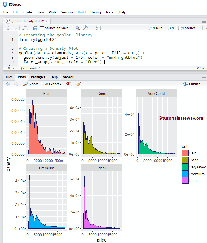
如何在 R ggplot2 密度图中进行分面
默认情况下,facet_wrap() 为所有分面分配相同的 y 轴。但您可以通过添加另一个名为 scale 的属性来更改它(为每个分面提供独立的轴)。
library(ggplot2)

ggplot(data = diamonds, aes(x = price, fill = cut)) +
  geom_density(adjust = 1/5, color = "midnightblue") +
  facet_wrap(~ cut, scale = "free")
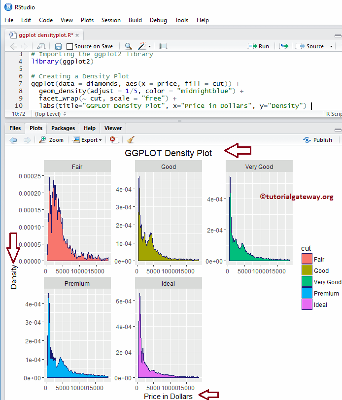
为 R ggplot 密度图分配名称
让我们使用 labs 函数为图表、X 轴和 Y 轴分配名称。
library(ggplot2)

ggplot(data = diamonds, aes(x = price, fill = cut)) +
  geom_density(adjust = 1/5, color = "midnightblue") +
  facet_wrap(~ cut, scale = "free") +
  labs(title="GGPLOT Density Plot", x="Price in Dollars", y="Density")
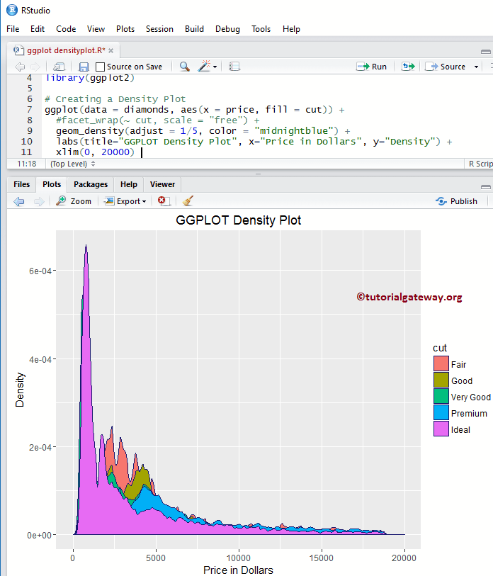
更改 R 密度图的轴限制
让我们更改 ggplot 密度图中的默认轴值。
- xlim:此参数有助于指定 X 轴的限制。在这里,我们将默认 x 轴限制更改为 (0, 20000)。
- ylim:帮助您指定 Y 轴限制。
library(ggplot2)

ggplot(data = diamonds, aes(x = price, fill = cut)) +
  #facet_wrap(~ cut, scale = "free") +
  geom_density(adjust = 1/5, color = "midnightblue") +
  labs(title="GGPLOT Density Plot", x="Price in Dollars", y="Density") +
  xlim(0, 20000)
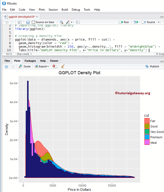
创建带有直方图的 R ggplot 密度图
在实际应用中,我们可能对基于密度的直方图感兴趣,因为。让我们使用 geom_histogram() 创建一个相对于直方图的 ggplot 密度图。
library(ggplot2)

ggplot(data = diamonds, aes(x = price, fill = cut)) +
  geom_density(color = "red") +
  geom_histogram(binwidth = 250, aes(y=..density..), fill = "midnightblue") +
  labs(title="GGPLOT Density Plot", x="Price in Dollars", y="Density")
更改 ggplot2 密度图的主题
如何更改默认主题?
- theme_dark():我们使用此函数将默认主题更改为 dark。键入 theme_,然后R Studio 的智能提示会显示可用选项的列表。例如,theme_grey()
library(ggplot2)

ggplot(data = diamonds, aes(x = price, fill = cut)) +
  geom_density(adjust = 1/5, color = "midnightblue") +
  facet_wrap(~ cut, scale = "free") +
  labs(title="GGPLOT Density Plot", x="Price in Dollars", y="Density") +
  theme_dark()