ggplot2 的 ggplot 箱线图对于按特定数据分组的数值数据的图形化可视化非常有用。让我们通过一个示例了解如何创建 R ggplot2 箱线图并格式化颜色、更改标签以及绘制水平和多个 ggplot 箱线图。
对于这个 ggplot2 ggplot 箱线图演示,我们使用了编程提供的两个数据集,分别是 ChickWeight 和 diamonds 数据集。
创建 R ggplot2 箱线图
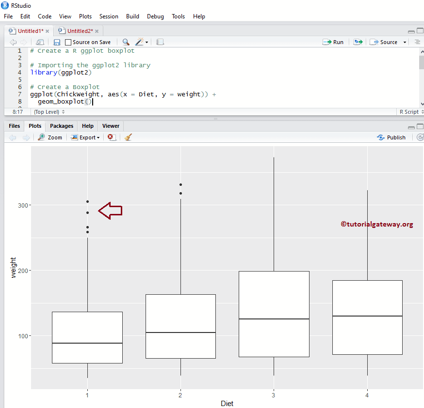
本示例展示了如何使用 ggplot2 包创建箱线图。在此演示中,我们将使用 Studio 提供的 ChickWeight 数据集。
library(ggplot2)

ggplot(ChickWeight, aes(x = Diet, y = weight)) +
  geom_boxplot()
更改 ggplot2 箱线图的颜色
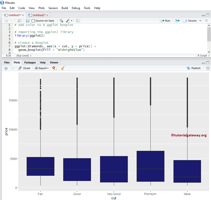
在此示例中,我们展示了如何使用 fill 参数更改 ggplot 箱线图的箱体颜色
- fill:请指定您要使用的颜色。在您的控制台中键入 colors() 可获取 R 编程中可用颜色的列表。
提示:ggplot2 包默认未在 R 编程 中安装。请参考“安装包”文章以了解如何安装该包。
library(ggplot2)

ggplot(diamonds, aes(x = cut, y = price)) +
  geom_boxplot(fill = "midnightblue")
更改颜色示例 2
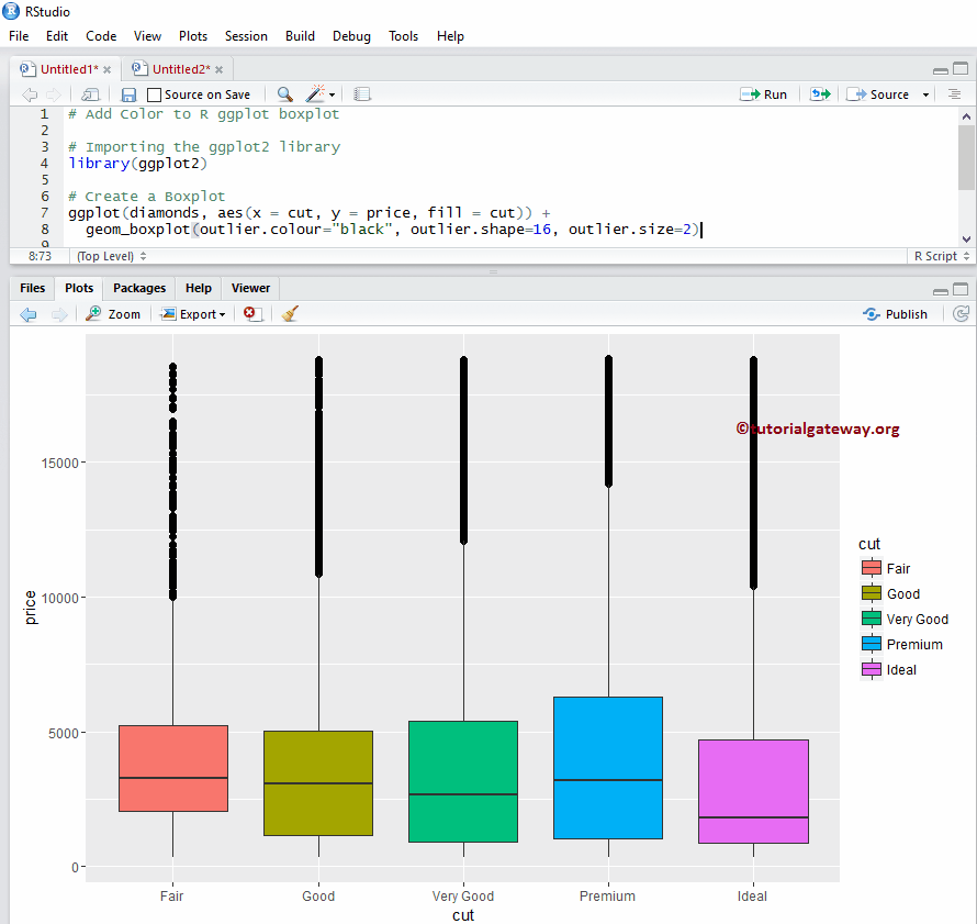
在此示例中,我们使用列数据来更改 R ggplo2 ggplot 箱线图的箱体颜色。在这里,我们使用 cut 列数据来区分颜色。
注意:如果您需要从外部文件导入数据,请参考 读取 CSV 以了解 CSV 文件导入涉及的步骤。
library(ggplot2)

ggplot(diamonds, aes(x = cut, y = price, fill = cut)) +
  geom_boxplot(outlier.colour="black", outlier.shape=16, outlier.size=2)
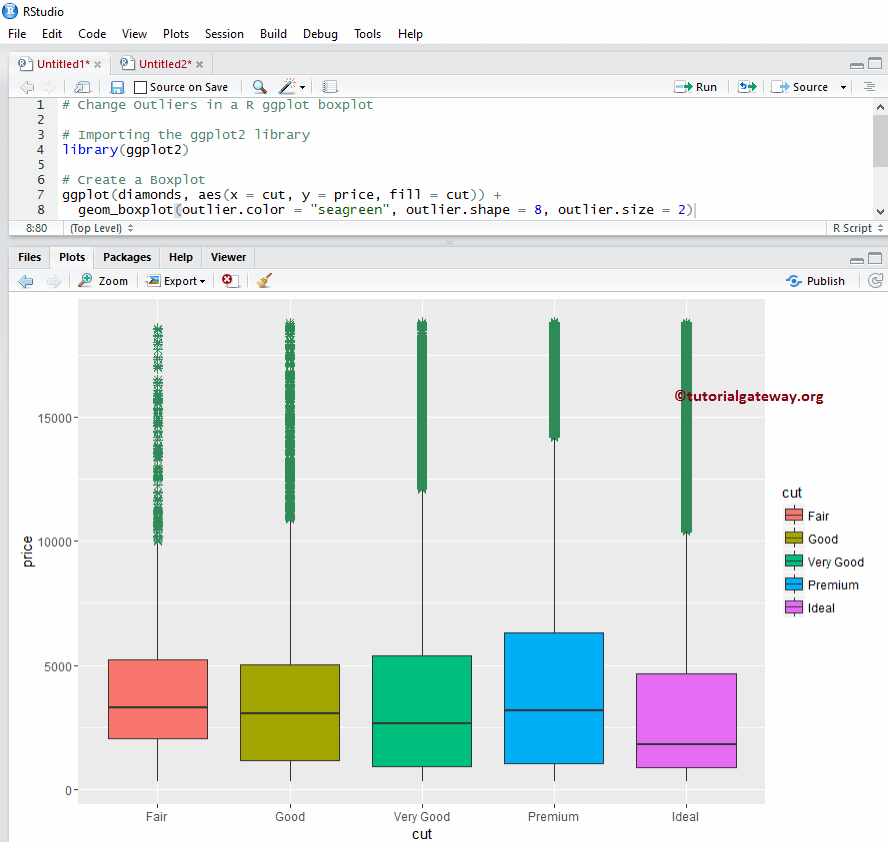
更改 R ggplot2 ggplot 箱线图的外围线
在此示例中,我们展示了如何使用以下参数更改 ggplot 箱线图外围线的颜色
- outlier.color:请指定要用于外围线的颜色。在您的控制台中键入 colors() 可获取 R 编程中可用颜色的列表。
- outlier.shape:请指定要用于外围线的形状。
- outlier.size:指定外围线的大小。
library(ggplot2)

ggplot(diamonds, aes(x = cut, y = price, fill = cut)) +
  geom_boxplot(outlier.color = "seagreen", outlier.shape = 8, outlier.size = 2)
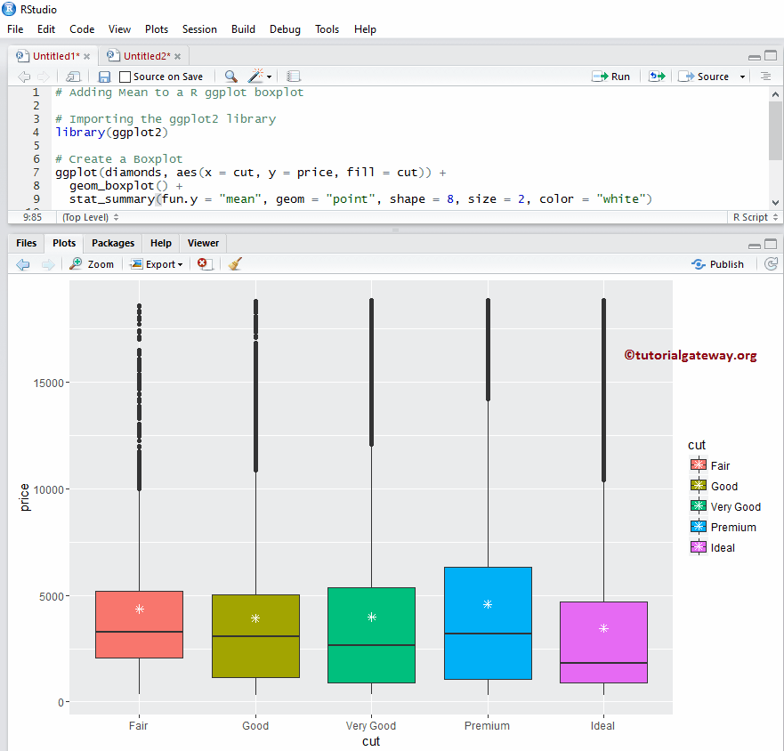
添加均值
在此示例中,我们使用 stat_summary 参数将均值添加到 ggplot 箱线图中
library(ggplot2)

ggplot(diamonds, aes(x = cut, y = price, fill = cut)) +
  geom_boxplot() +
  stat_summary(fun.y = "mean", geom = "point", shape = 8, size = 2, color = "white")
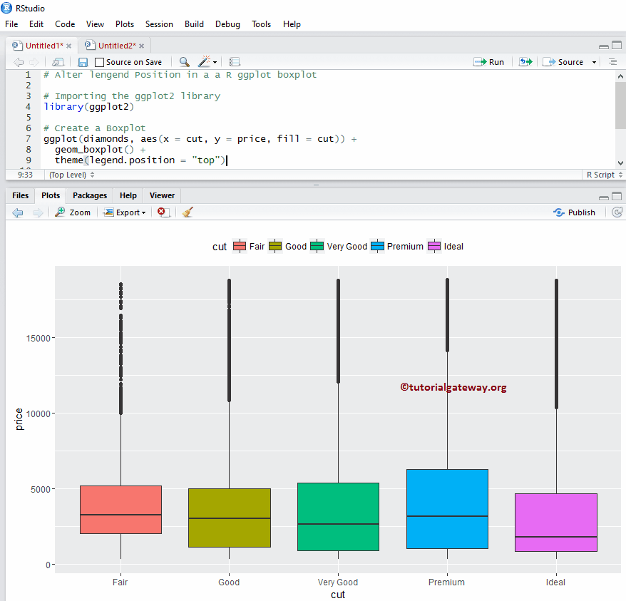
更改 R ggplot2 箱线图的图例位置
默认情况下,ggplot 将图例定位在右侧。在此示例中,我们将图例位置从右侧更改为顶部。注意,您可以使用 legend.position = “none” 完全移除图例。
library(ggplot2)

ggplot(diamonds, aes(x = cut, y = price, fill = cut)) +
  geom_boxplot() +
  theme(legend.position = "top")
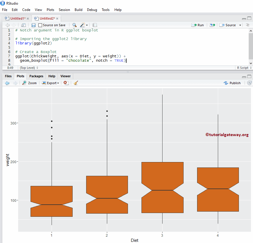
箱线图中的 Notch 参数
在这里,我们使用 ggplot 箱线图中的 notch 参数在箱体的两侧绘制一条线。如果两个图的切口重叠,则我们可以说它们的中间值是相同的。否则,它们是不同的。
- notch:这是一个布尔参数。如果为 TRUE,则在箱体的两侧绘制一个切口。
library(ggplot2)

ggplot(ChickWeight, aes(x = Diet, y = weight)) +
  geom_boxplot(fill = "chocolate", notch = TRUE)
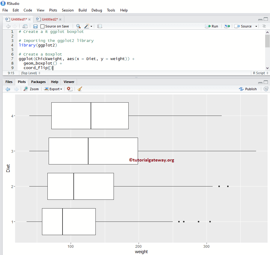
R ggplot2 中的水平 ggplot 箱线图
在此示例中,我们使用 coord_flip() 函数将默认的垂直箱线图更改为水平箱线图
library(ggplot2)

ggplot(ChickWeight, aes(x = Diet, y = weight)) +
  geom_boxplot() +
  coord_flip()
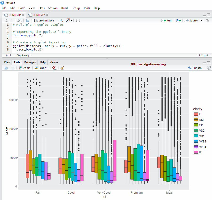
ggplot2 中的多个 ggplot 箱线图
在此示例中,我们展示了如何在编程中对多个 ggplot 箱线图进行分组。
library(ggplot2)

ggplot(diamonds, aes(x = cut, y = price, fill = clarity)) +
  geom_boxplot()
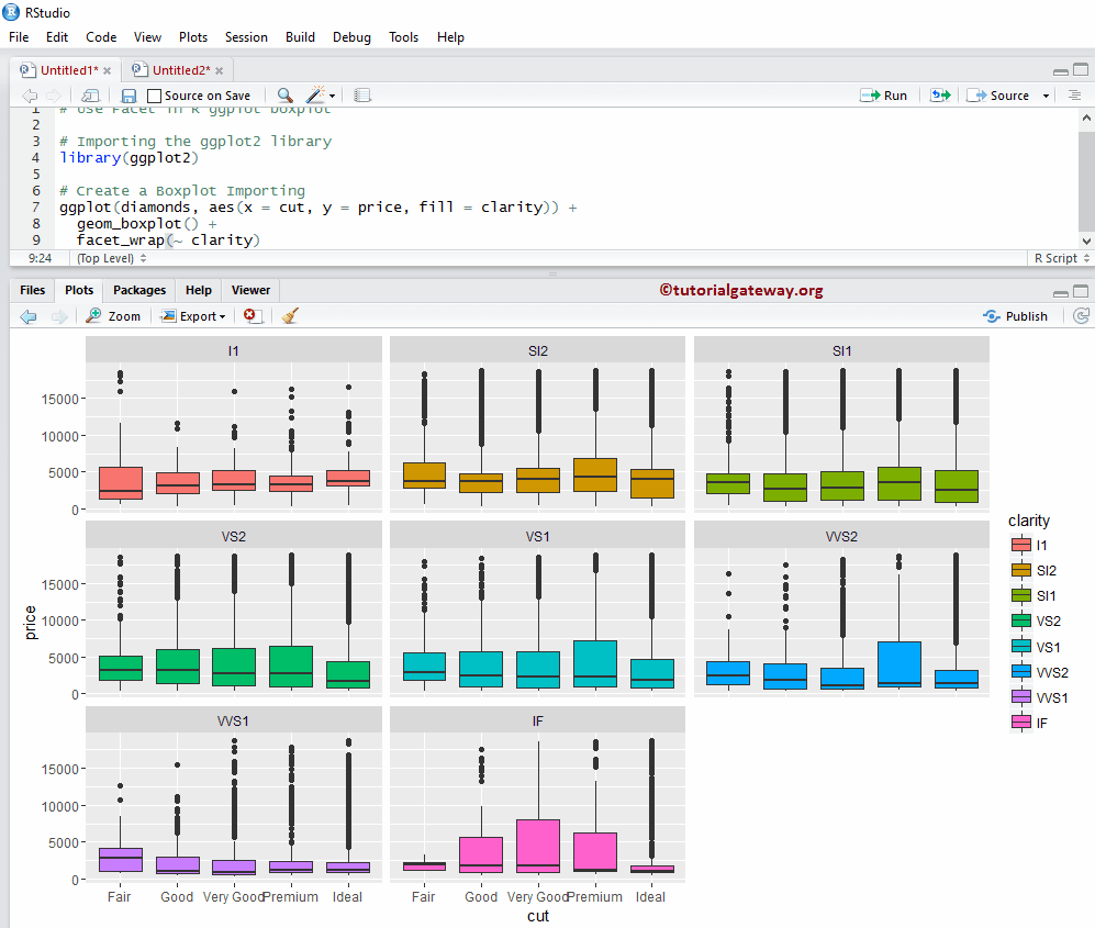
如何在 R ggplot2 箱线图中使用分面?
在此示例中,我们通过根据列值划分数据来绘制多个箱线图。在这里,我们使用 clarity 列数据来划分它们。
library(ggplot2)

ggplot(diamonds, aes(x = cut, y = price, fill = clarity)) +
  geom_boxplot() +
  facet_wrap(~ clarity)
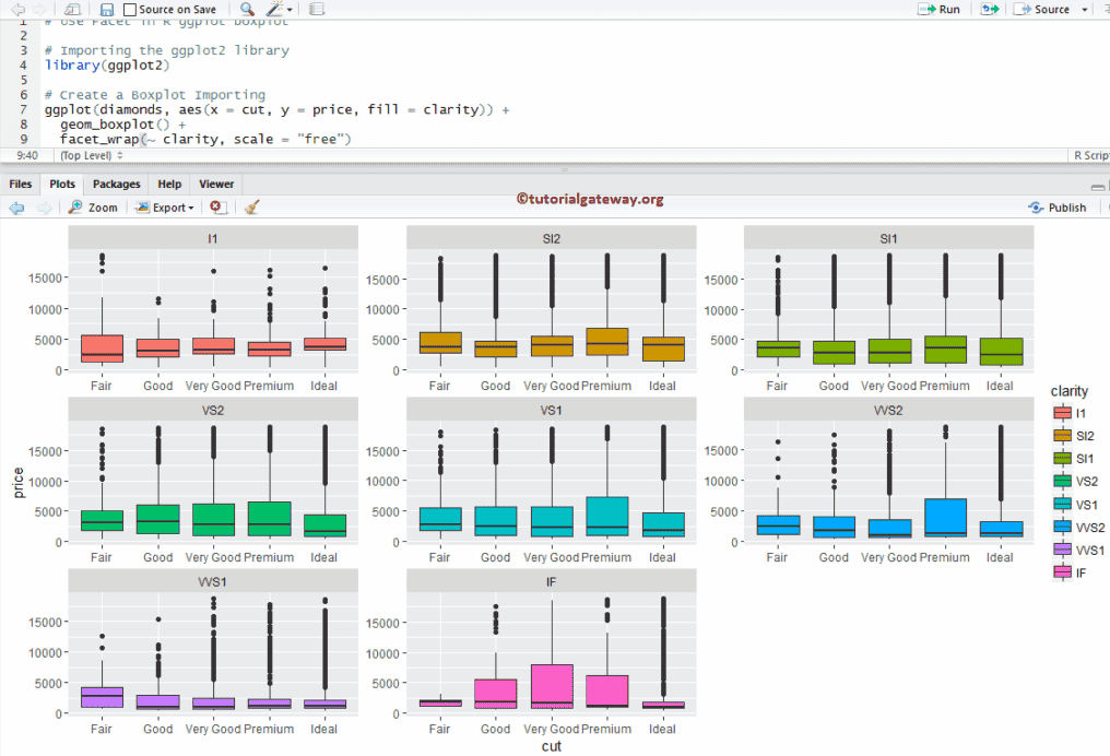
分面示例 2
默认情况下,facet_wrap() 为所有图分配相同的 Y 轴。但是,您可以通过添加一个名为 scale 的附加属性,为每个 R ggplot 箱线图更改它(为其分配独立的轴)。
library(ggplot2)

ggplot(diamonds, aes(x = cut, y = price, fill = clarity)) +
  geom_boxplot() +
  facet_wrap(~ clarity, scale = "free")
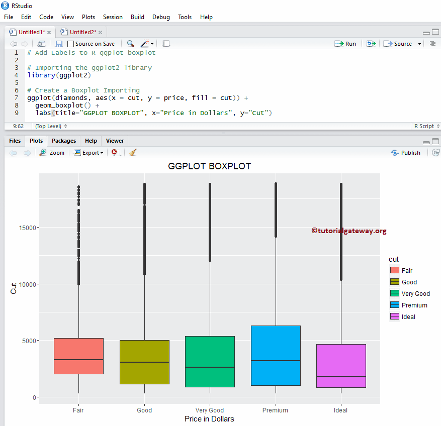
分配名称
在此示例中,我们使用 labs 函数为图表、X 轴和 Y 轴分配名称。
library(ggplot2)

ggplot(diamonds, aes(x = cut, y = price, fill = cut)) +
  geom_boxplot() +
  labs(title="GGPLOT BOXPLOT", x="Price in Dollars", y="Cut")
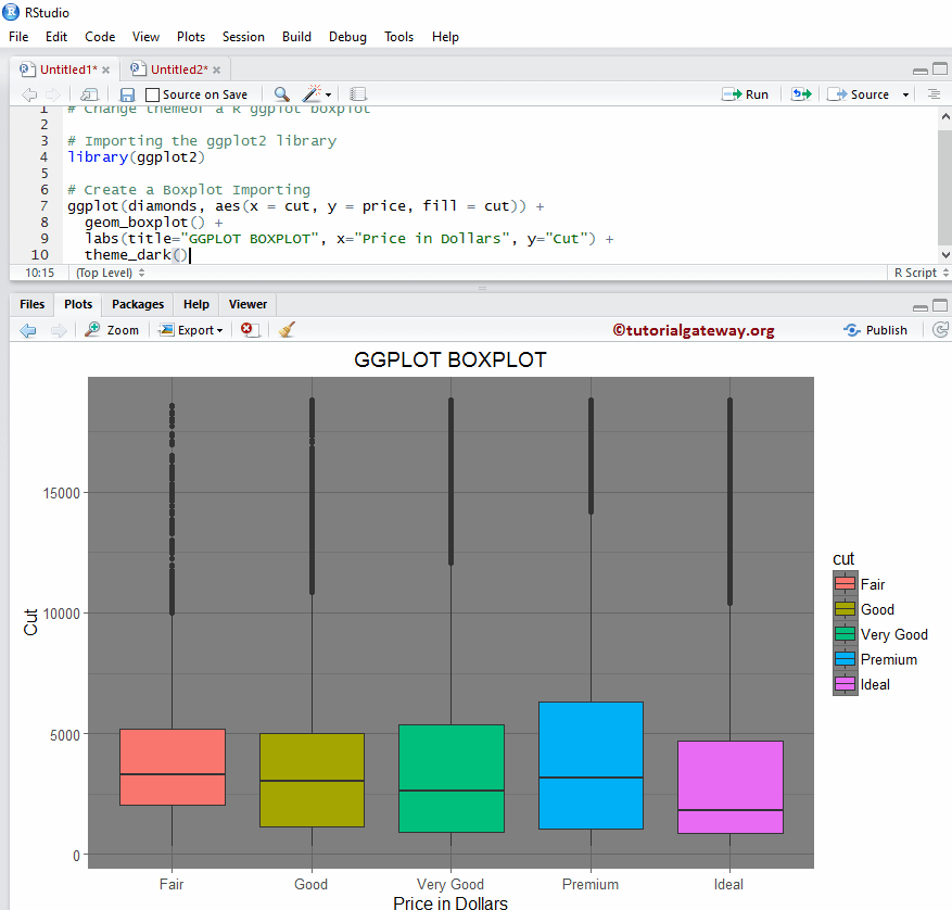
更改 ggplot2 箱线图主题
在此示例中,我们更改了 ggplot2 箱线图的默认主题。
- theme_dark(): 我们正在使用此函数将默认主题更改为暗色。键入 theme_,然后 R Studio 的智能提示会显示可用选项列表。例如,theme_grey()。
library(ggplot2)

ggplot(diamonds, aes(x = cut, y = price, fill = cut)) +
  geom_boxplot() +
  labs(title="GGPLOT BOXPLOT", x="Price in Dollars", y="Cut") +
  theme_dark()