Python matplotlib pyplot 散点图是数据的二维图形表示。散点图有助于显示两个数值数据值或两个数据集之间的相关性。通常,我们使用此 pyplot 散点图通过绘制回归线来分析两个数值数据点之间的关系。
Python matplotlib pyplot 模块有一个函数可以绘制或生成散点图,其基本语法是
matplotlib.pyplot.scatter(x, y)
- x:表示 X 轴的参数列表。
- y:表示 Y 轴的参数列表。
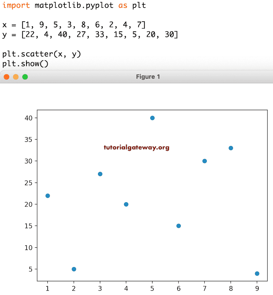
Python matplotlib pyplot 散点图示例
这是一个简单的散点图示例,我们声明了两个随机数值列表。接下来,我们使用 pyplot 函数绘制了 x 对 y 的散点图。
import matplotlib.pyplot as plt

x = [1, 9, 5, 3, 8, 6, 2, 4, 7]

y = [22, 4, 40, 27, 33, 15, 5, 20, 30]

plt.scatter(x, y)
plt.show()
在这里,我们使用 Python randint 函数为 x 和 y 生成了 50 个 5 到 50 和 100 到 1000 之间的随机整数值。接下来,我们绘制散点图。
import matplotlib.pyplot as plt
import numpy as np

x = np.random.randint(5, 50, 50)

y = np.random.randint(100, 1000, 50)

print(x)
print(y)

plt.scatter(x, y)

plt.show()
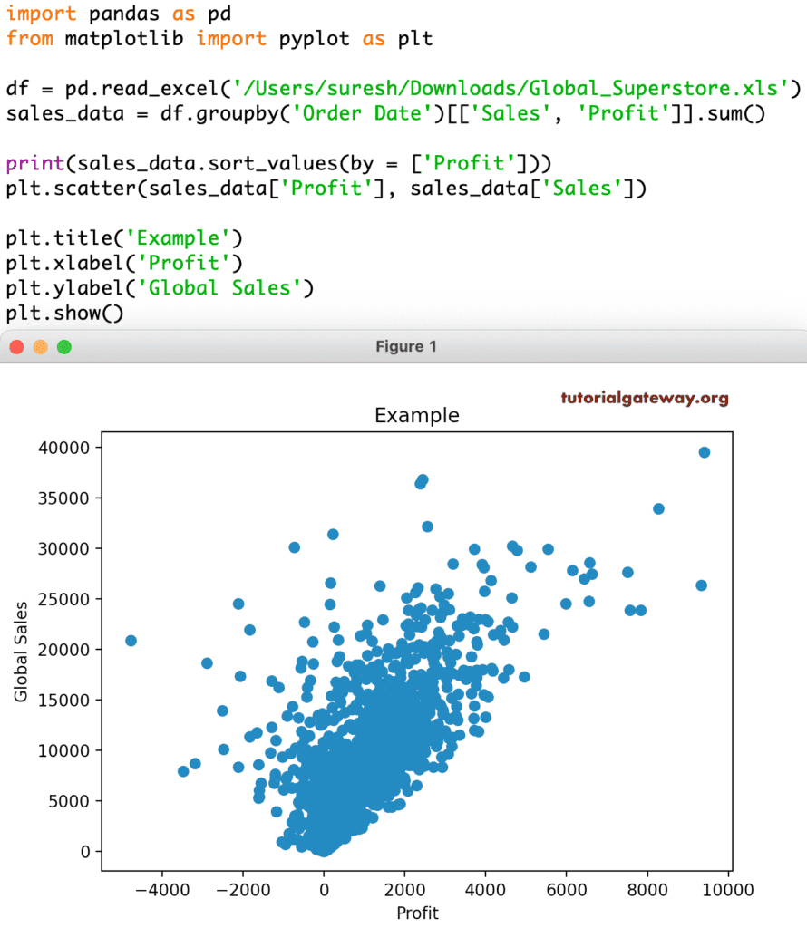
使用 CSV 的 Python matplotlib pyplot 散点图或图表
在此示例中,我们读取了 CSV 文件并将其转换为 DataFarme。接下来,我们使用 X 轴上的利润和 Y 轴上的销售额绘制散点图。
import pandas as pd
from matplotlib import pyplot as plt

df = pd.read_excel('/Users/suresh/Downloads/Global_Superstore.xls')

sales_data = df.groupby('Order Date')[['Sales', 'Profit']].sum()

print(sales_data.sort_values(by = ['Profit']))

plt.scatter(sales_data['Profit'], sales_data['Sales'])

plt.show()
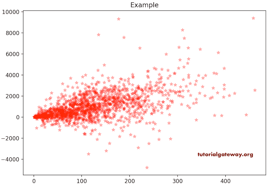
Python matplotlib pyplot 散点图标题
我们已经在之前的图表中提到了图表的标签。在此 pyplot 散点图示例中,我们使用了 xlable、ylabel 和 title 函数来显示 X 轴、Y 轴标签和图表标题。
plt.title('Example')
plt.xlabel('Profit')
plt.ylabel('Global Sales')
plt.show()
Python matplotlib pyplot 散点图颜色和标记
在我们之前的所有示例中,您可以看到默认颜色为蓝色。但是,您可以使用颜色参数更改标记颜色,并使用 alpha 参数更改不透明度。在此 pyplot 散点图示例中,我们将标记颜色更改为红色,不透明度更改为 0.3(略浅)。
除此之外,您还可以使用 markers 参数更改默认标记形状。在这里,我们将标记的形状更改为 *。我建议您参考 matplotlib 文章以了解可用标记的列表。
import pandas as pd
from matplotlib import pyplot as plt

df = pd.read_excel('/Users/suresh/Downloads/Global_Superstore.xls')

market_data = df.groupby('Order Date')[['Quantity', 'Profit']].sum()

plt.scatter(market_data['Quantity'], market_data['Profit'],
            color = 'red',
            marker = '*', alpha = 0.3)

plt.title('Example')
plt.show()
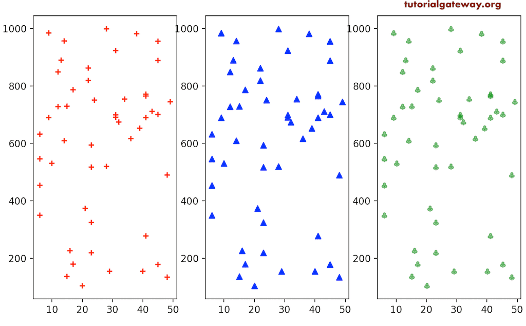
在这里,我们尝试展示其中另外三种可用的标记。
import matplotlib.pyplot as plt
import numpy as np

x = np.random.randint(5, 50, 50)

y = np.random.randint(100, 1000, 50)

fix, (ax1, ax2, ax3) = plt.subplots(1, 3, figsize = (8, 4))

ax1.scatter(x, y, marker = '+', color = 'red')
ax2.scatter(x, y, marker = '^', color = 'blue')
ax3.scatter(x, y, marker = '$\clubsuit$', color = 'green',
            alpha = 0.5)

plt.show()
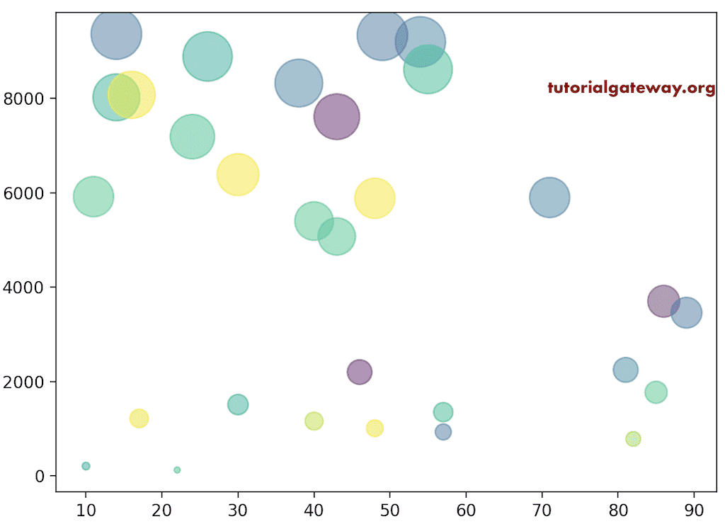
在之前的 Python matplotlib pyplot 散点图示例中,我们对与轴值相关联的所有标记使用单一颜色。但是,使用 color 参数,您可以为每个标记使用多种或单独的颜色。
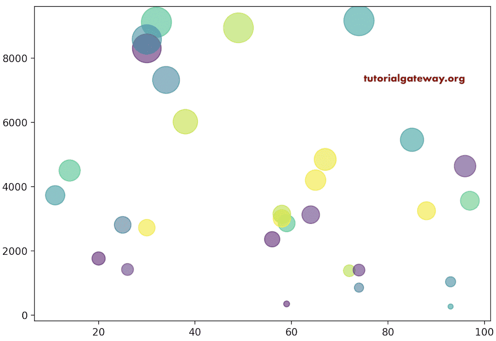
在这里,我们定义了两个随机整数数组和一个用于颜色的随机数组。接下来,我们将该颜色数组分配给 c 以生成标记的随机颜色。
import matplotlib.pyplot as plt
import numpy as np

x = np.random.randint(10, 100, 30)

y = np.random.randint(100, 10000, 30)

colors = np.random.rand(30)

plt.scatter(x, y, c = colors, alpha = 0.5, s = y/10)

plt.show()
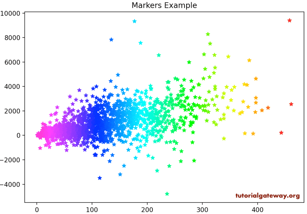
这是为标记分配不同颜色的另一种方式。除了上述之外,您还可以使用 color 和 cmap 参数为标记定义渐变(例如,彩虹)。为此,首先,您必须将定义标记颜色的值列表作为 c 参数分配。其次,您必须定义 cmap 颜色(您要使用的渐变),如下面我们定义的。
import pandas as pd
from matplotlib import pyplot as plt

df = pd.read_excel('/Users/suresh/Downloads/Global_Superstore.xls')

market_data = df.groupby('Order Date')[['Sales', 'Quantity', 'Profit']].sum()

plt.scatter(market_data['Quantity'], market_data['Profit'],
            c = market_data['Quantity'],cmap = 'gist_rainbow_r',
            marker = '*')

plt.title('Markers Example')

plt.show()
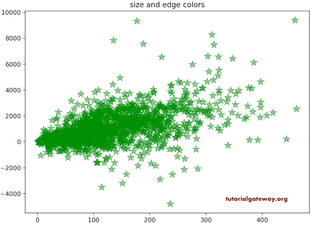
Python matplotlib pyplot 散点图大小和边缘颜色
matplotlib 散点函数有一个 s 参数,用于定义标记的大小。它接受所有标记的静态一个值或类似数组的值。在这里,我们将 150 分配为标记大小,这意味着所有标记都将调整为该值的大小。
import pandas as pd
from matplotlib import pyplot as plt

df = pd.read_excel('/Users/suresh/Downloads/Global_Superstore.xls')

market_data = df.groupby('Order Date')[['Quantity', 'Profit']].sum()

plt.scatter(market_data['Quantity'], market_data['Profit'],
            color = 'green', marker = '*', alpha = 0.5,
            s = 150)

plt.title('size and edge colors')

plt.show()
在此 Python matplotlib pyplot 散点图示例中,我们将 y/10 分配为 s 值。这意味着每个标记值都将不同,并且完全基于 y 值。
import matplotlib.pyplot as plt
import matplotlib.patches as patches
import numpy as np

x = np.random.randint(10, 100, 30)

y = np.random.randint(100, 10000, 30)

colors = np.random.rand(30)

plt.scatter(x, y, c = colors, alpha = 0.6, s = y/10)

plt.show()
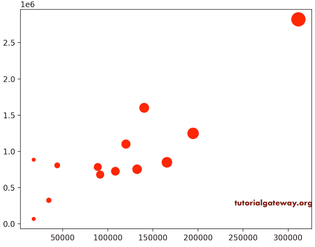
让我举一个 CSV 文件示例。在这里,我们使用利润和销售额值进行绘制。接下来,我们根据利润定义了标记的大小。这意味着当利润更高时,标记大小会增加。
import pandas as pd
from matplotlib import pyplot as plt

df = pd.read_excel('/Users/suresh/Downloads/Global_Superstore.xls')

sales_data = df.groupby('Region')[['Sales', 'Profit']].sum()

print(sales_data.sort_values(by = ['Profit']))

plt.scatter(sales_data['Profit'], sales_data['Sales'], marker = 'o',
            color = 'r', s = sales_data['Profit']/ 1000)

plt.show()
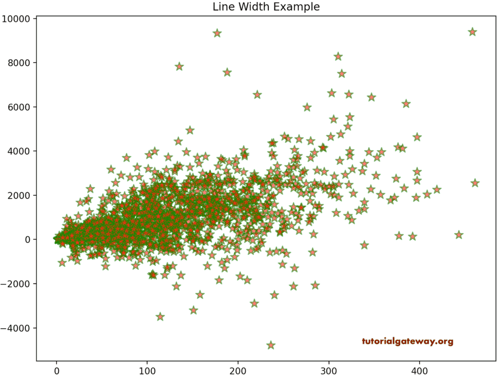
linewidths 参数接受标量值或数组,默认值为 None。此 pyplot 散点图 linewidths 参数定义标记边缘的宽度。edgecolors 参数允许选择标记的线边缘颜色。在此示例中,我们将线宽分配为 1.1,将边缘颜色分配为绿色。
import pandas as pd
from matplotlib import pyplot as plt

df = pd.read_excel('/Users/suresh/Downloads/Global_Superstore.xls')

market_data = df.groupby('Order Date')[['Quantity', 'Profit']].sum()

plt.scatter(market_data['Quantity'], market_data['Profit'],
            color = 'red', marker = '*', alpha = 0.6,
            s = 100,  linewidths = 1.1, edgecolors = 'g')

plt.title('Line Width Example')

plt.show()
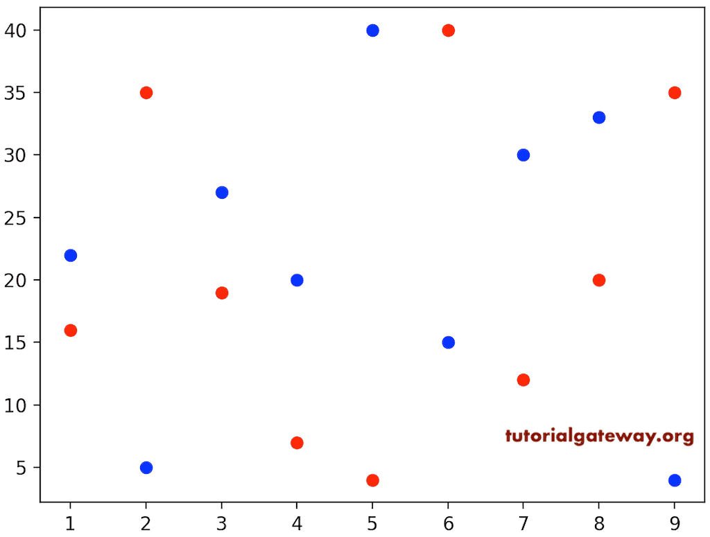
多个散点图
Python matplotlib pyplot 散点函数还允许您绘制多个绘图值。首先,我们绘制 y 对 x,然后我们绘制 z 对 x。它将在一个图表中显示 z 和 y 值对 x,以区分它们。我们使用了红色和蓝色。
import matplotlib.pyplot as plt

x = [1, 9, 5, 3, 8, 6, 2, 4, 7]

y = [22, 4, 40, 27, 33, 15, 5, 20, 30]

z = [16, 35, 4, 19, 20, 40, 35, 7, 12]

plt.scatter(x, y, color = 'blue')
plt.scatter(x, z, color = 'red')
plt.show()
这是绘制多个图表的另一个示例。但是,这次我们正在使用 CSV 文件来比较区域和市场销售额与利润。
df = pd.read_excel('/Users/suresh/Downloads/Global_Superstore.xls')

region_data = df.groupby('Region')[['Sales', 'Profit']].sum()

market_data = df.groupby('Market')[['Sales', 'Profit']].sum()

plt.scatter(region_data['Profit'], region_data['Sales'],
            s= 100, marker = '*', color = 'yellow',
             linewidths = 1.1, edgecolors = 'g')

plt.scatter(market_data['Profit'], market_data['Sales'],
            s =100, marker = 'o', color = 'r')

plt.title('Multiple ones')

plt.show()
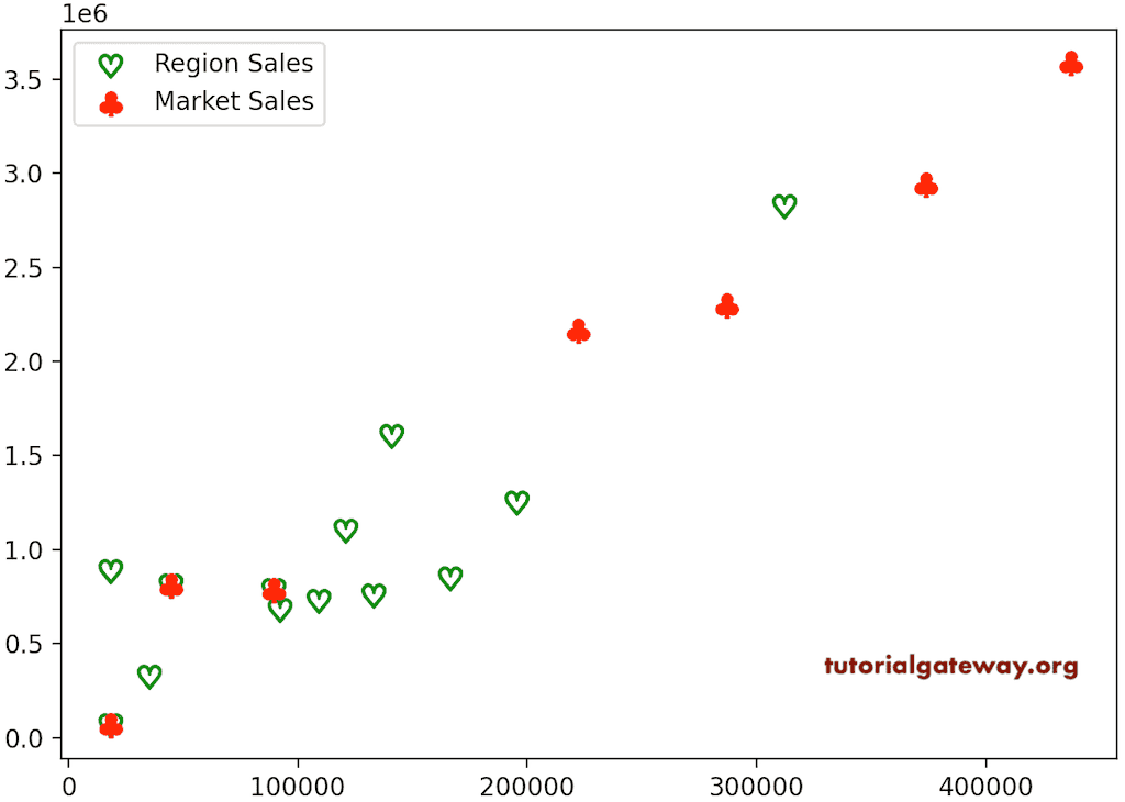
向 Python matplotlib pyplot 散点图添加图例
从上面的屏幕截图中可以看到,您可能不知道或无法识别哪些标记代表区域的销售额和市场。为了解决这个问题,您可以使用 legend 函数向散点图添加图例。
df = pd.read_excel('/Users/suresh/Downloads/Global_Superstore.xls')

region_data = df.groupby('Region')[['Sales', 'Profit']].sum()

market_data = df.groupby('Market')[['Sales', 'Profit']].sum()

plt.scatter(region_data['Profit'], region_data['Sales'],
            label = 'Region Sales',
            s= 100, marker = '$\heartsuit$', color = 'b',
             linewidths = 1.2, edgecolors = 'g')

plt.scatter(market_data['Profit'], market_data['Sales'],
            label = 'Market Sales',
            s =100, marker = '$\clubsuit$', color = 'r')

plt.legend()
plt.show()
突出显示区域
在某些情况下,您可能需要在散点图内关注特定的位置或区域。因此,您需要突出显示该特定区域以更好地聚焦。您所需要做的就是向现有区域添加补丁。在此示例中,我们添加了一个矩形来突出显示该区域。
import pandas as pd
import matplotlib.pyplot as plt
import matplotlib.patches as patches

df = pd.read_excel('/Users/suresh/Downloads/Global_Superstore.xls')

market_data = df.groupby('Order Date')[['Quantity', 'Profit']].sum()

fig, ax = plt.subplots()

ax.scatter(market_data['Quantity'], market_data['Profit'],
            color = '#A90303', marker = '*', alpha = 0.6,
            s = 100,  linewidths = 1.1, edgecolors = '#A4F5AF')

ax.add_patch(patches.Rectangle((50, -50), 100, 2000, alpha = 0.3))

plt.show()
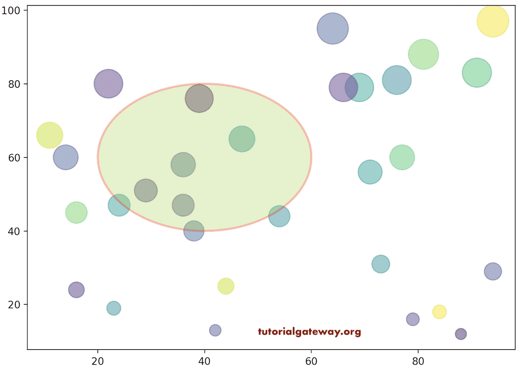
同样,我们可以向该区域添加一个圆。除此之外,我们可以格式化该圆以更好地查看它。在此示例中,我们向此随机值图表添加一个圆,然后格式化颜色、线宽等。
import matplotlib.pyplot as plt
import matplotlib.patches as patches
import numpy as np

x = np.random.randint(10, 100, 30)

y = np.random.randint(10, 101, 30)

colors = np.random.rand(30)

fig, ax = plt.subplots()

ax.scatter(x, y, c = colors, alpha = 0.5, s = y*10)

ax.add_patch(
    patches.Circle((40, 60), 20, alpha = 0.3,
                   edgecolor = 'red', facecolor = 'yellowgreen',
                   linewidth = 2, linestyle = 'solid'))

plt.show()
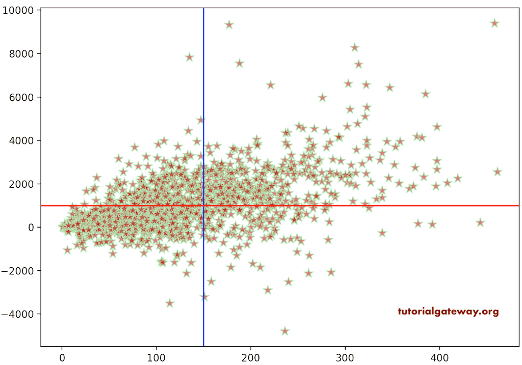
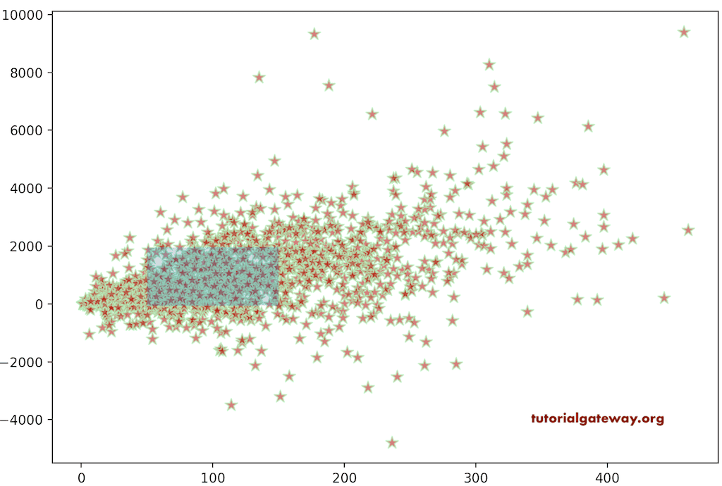
通过使用 axvline 函数,您可以在 pyplot 散点图内添加垂直线。同样,使用 axhline 添加水平线。
import pandas as pd
import matplotlib.pyplot as plt
import matplotlib.patches as patches

df = pd.read_excel('/Users/suresh/Downloads/Global_Superstore.xls')

market_data = df.groupby('Order Date')[['Quantity', 'Profit']].sum()

plt.scatter(market_data['Quantity'], market_data['Profit'],
            color = '#A90303', marker = '*', alpha = 0.6,
            s = 100,  linewidths = 1.1, edgecolors = '#A4F5AF')

plt.axvline(150, color = 'b')
plt.axhline(1000, color = 'red')
plt.show()