Python Matplotlib 直方图与 pyplot 条形图相似。然而,数据将被等量分布到各个箱中。每个箱代表数据区间,直方图将数值数据的频率与这些箱进行比较。
在 Python 中,您可以使用 Matplotlib 库,借助 pyplot 的 hist 函数来绘制直方图。绘制直方图的 hist 语法是
matplotlib.pyplot.pie(x, bins)
在上面的 pyplot 直方图语法中,x 代表您想在 Y 轴上使用的数值数据,而 bins 将用于 X 轴。
简单的 Matplotlib 直方图示例
在这个例子中,我们生成了一个随机数组并将其赋值给 x。接着,我们使用 pyplot 的 hist 函数绘制了一个直方图。请注意,我们没有使用 bins 参数。
import matplotlib.pyplot as plt
import numpy as np

x = np.random.randn(1000)
print(x)

plt.hist(x)

plt.show()
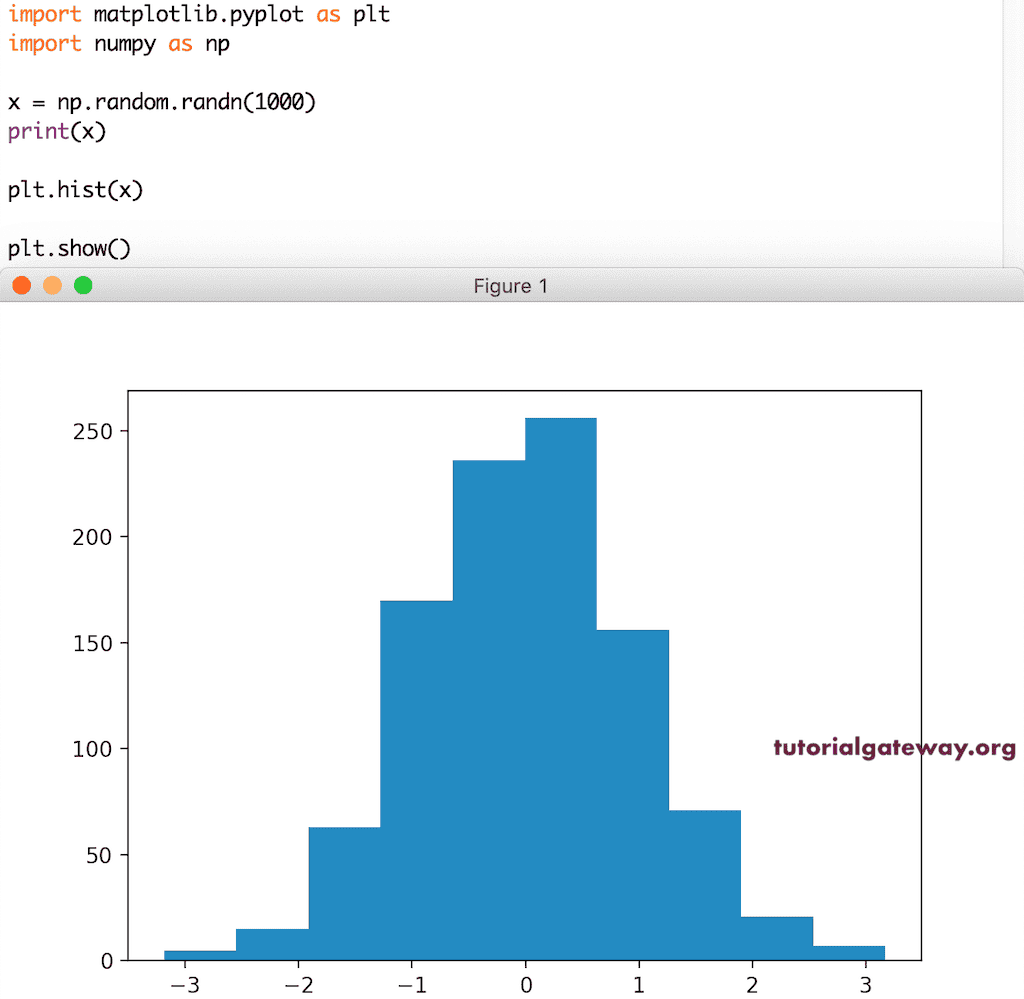
由于我们使用的是随机数组,所以您看到的图片或截图可能与此不同。
绘制的第一步是使用值的下限和上限创建等宽的箱。然而,在上面的Python示例中,我们没有使用这个参数,因此 hist 函数将自动创建并使用默认的箱。
在这里,我们通过将 20 赋给它,明确地使用了这个参数。这意味着下面的代码将绘制随机数的直方图,数据将被等量分布到 20 个箱中。
x = np.random.randn(1000)
print(x)

plt.hist(x, bins = 20)

plt.show()
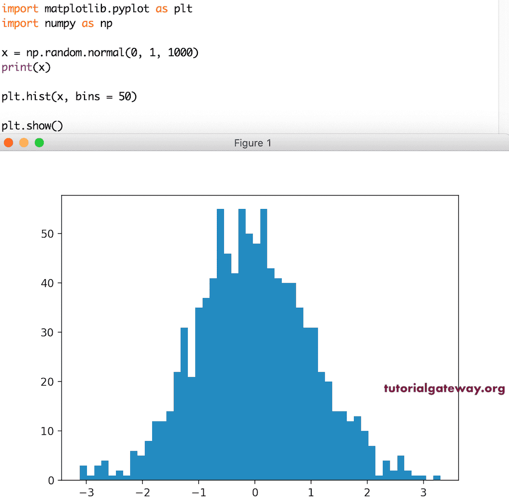
这是另一个带有箱大小为 50 的随机数的 pyplot 直方图示例。
x = np.random.normal(0, 1, 1000)
print(x)

plt.hist(x, bins = 50)

plt.show()
使用 CSV 文件绘制 Python Matplotlib 直方图
在这个例子中,我们使用 CSV 文件来绘制直方图。如您从下面的代码中看到的,我们使用订单数量作为 Y 轴的值。
import numpy as np
import pandas as pd
from matplotlib import pyplot as plt

df = pd.read_excel('/Users/suresh/Downloads/Global_Superstore.xls')

data = df['Quantity']
bins=np.arange(min(data), max(data) + 1, 1)

print(df['Quantity'].count())
plt.hist(df['Quantity'], bins)

plt.show()
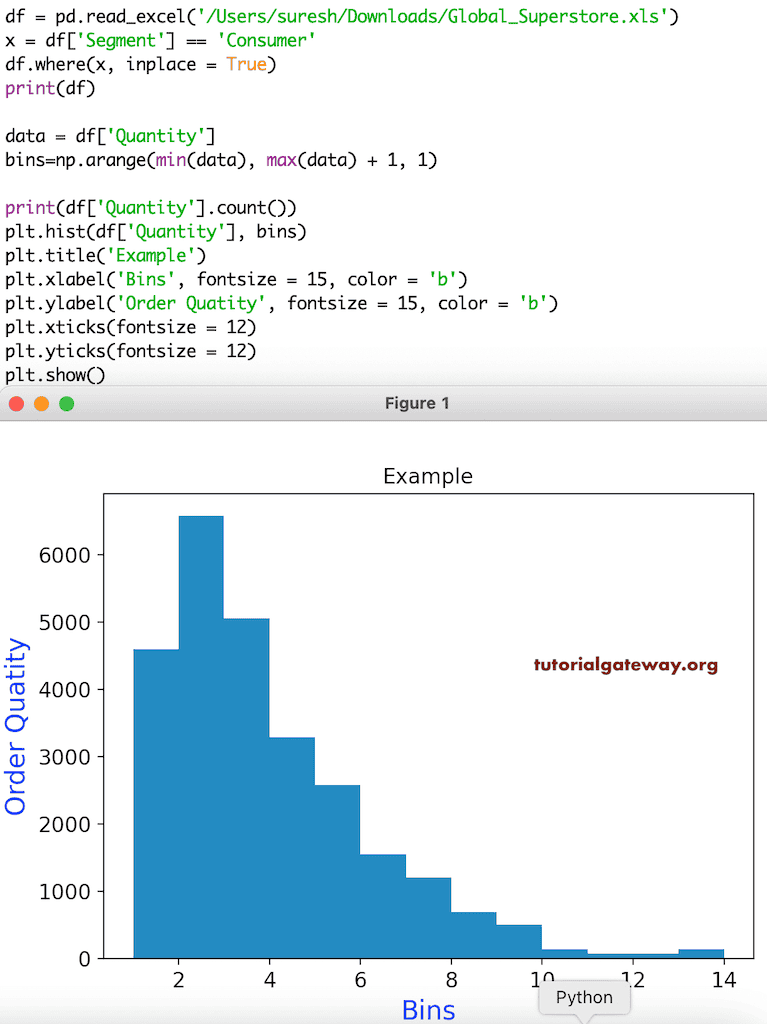
pyplot 直方图标题
此示例展示了如何添加标题、X 轴和 Y 轴标签。在此示例中,我们还格式化了 X 和 Y 标签、X 和 Y 刻度的字体大小和颜色。如果您注意到下面的代码,我们正在使用 Segment 等于 Consumer 的数据。
df = pd.read_excel('/Users/suresh/Downloads/Global_Superstore.xls')

x = df['Segment'] == 'Consumer'
df.where(x, inplace = True)
print(df)

data = df['Quantity']
bins=np.arange(min(data), max(data) + 1, 1)

print(df['Quantity'].count())
plt.hist(df['Quantity'], bins)

plt.title('Example')
plt.xlabel('Bins', fontsize = 15, color = 'b')
plt.ylabel('Order Quatity', fontsize = 15, color = 'b')
plt.xticks(fontsize = 12)
plt.yticks(fontsize = 12)

plt.show()
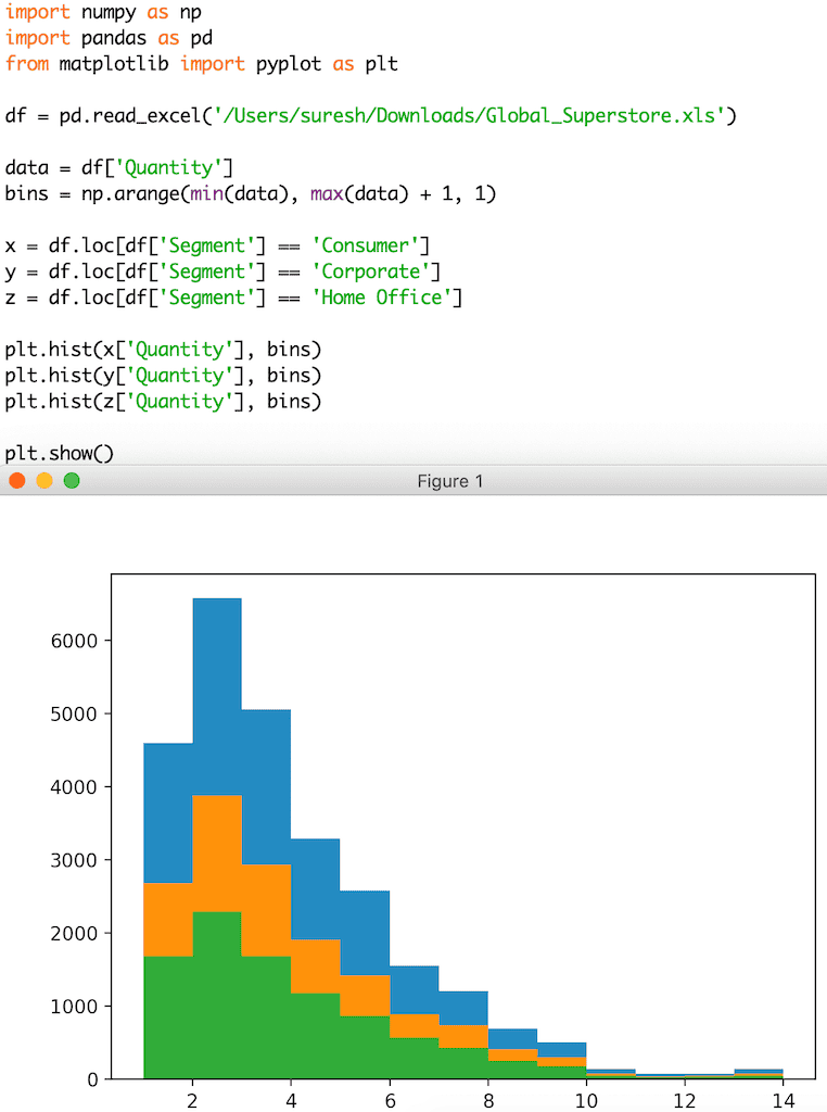
多个 Python Matplotlib pyplot 直方图
在此示例中,我们尝试绘制多个直方图。
df = pd.read_excel('/Users/suresh/Downloads/Global_Superstore.xls')

dat = df['Quantity']
bins = np.arange(min(dat), max(dat) + 1, 1)

x = df.loc[df['Segment'] == 'Consumer']
y = df.loc[df['Segment'] == 'Corporate']
z = df.loc[df['Segment'] == 'Home Office']

plt.hist(x['Quantity'], bins)
plt.hist(y['Quantity'], bins)
plt.hist(z['Quantity'], bins)

plt.show()
控制 pyplot hist 箱体大小
这是我们上面展示过的同一个 pyplot 直方图示例。然而,这次我们将箱的范围更改为静态值 5。这意味着数据的总数量被分配到五个箱中。
import numpy as np
import pandas as pd
from matplotlib import pyplot as plt

df = pd.read_excel('/Users/suresh/Downloads/Global_Superstore.xls')

data = df['Quantity']
bn = 5

x = df.loc[df.Segment == 'Consumer', 'Quantity']
y = df.loc[df.Segment == 'Corporate', 'Quantity']
z = df.loc[df.Segment == 'Home Office', 'Quantity']

plt.hist(x,bn)
plt.hist(y, bn)
plt.hist(z, bn)

plt.show()
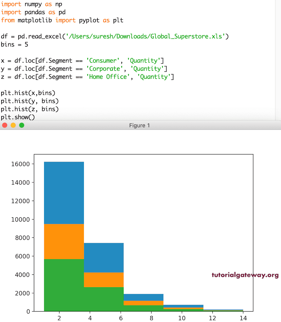
正如您所注意到的,两者之间存在差异。这是由于它们的箱体发生了变化。
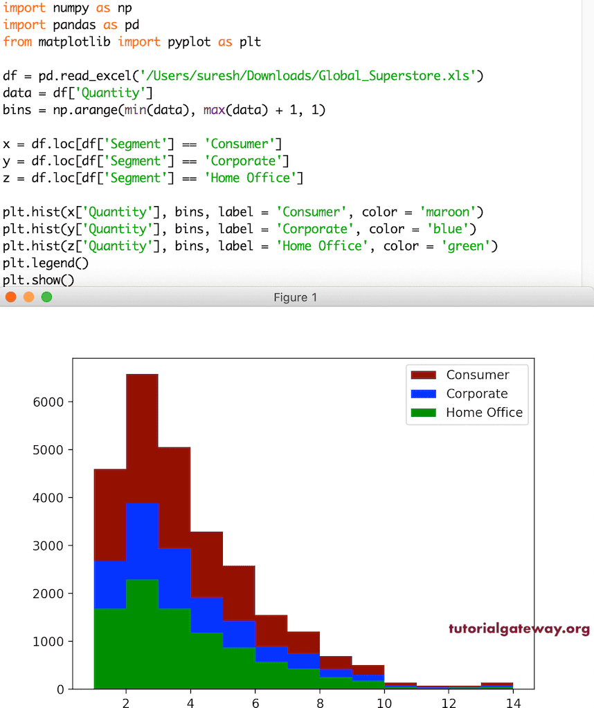
Python Matplotlib pyplot 直方图图例
在使用多个值时,识别哪个属于哪个类别是必要的。否则,用户会感到困惑。为了解决这些问题,您必须使用 pyplot 的 legend 函数启用图例。然后,使用 hist 函数的 labels 参数为每个直方图添加标签。
import numpy as np
import pandas as pd
from matplotlib import pyplot as plt

df = pd.read_excel('/Users/suresh/Downloads/Global_Superstore.xls')

dat = df['Quantity']
bs = np.arange(min(dat), max(dat) + 1, 1)

x = df.loc[df['Segment'] == 'Consumer']
y = df.loc[df['Segment'] == 'Corporate']
z = df.loc[df['Segment'] == 'Home Office']

plt.hist(x['Quantity'], bs, label = 'Consumer')
plt.hist(y['Quantity'], bs, label = 'Corporate')
plt.hist(z['Quantity'], bs, label = 'Home Office')

plt.legend()
plt.show()
格式化直方图颜色
无论是单个还是多个直方图,系统都会自动为其分配默认颜色。但是,您可以使用 pyplot hist 函数的 color 参数来更改直方图的颜色。在此示例中,我们将第一个直方图设置为栗色,第二个设置为蓝色,第三个设置为绿色。
df = pd.read_excel('/Users/suresh/Downloads/Global_Superstore.xls')

da = df['Quantity']
bs = np.arange(min(da), max(da) + 1, 1)

x = df.loc[df['Segment'] == 'Consumer']
y = df.loc[df['Segment'] == 'Corporate']
z = df.loc[df['Segment'] == 'Home Office']

plt.hist(x['Quantity'], bs, label = 'Consumer', color = 'maroon')
plt.hist(y['Quantity'], bs, label = 'Corporate', color = 'blue')
plt.hist(z['Quantity'], bs, label = 'Home Office', color = 'green')

plt.legend()
plt.show()
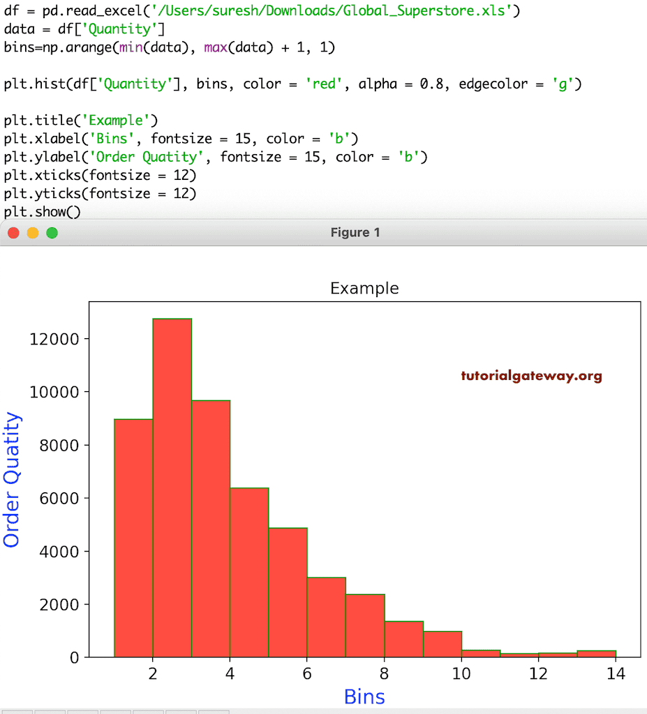
同样,您可以使用 alpha 和 edgecolor 参数更改箱体边缘的颜色和不透明度。
df = pd.read_excel('/Users/suresh/Downloads/Global_Superstore.xls')
da = df['Quantity']
bins=np.arange(min(da), max(da) + 1, 1)

plt.hist(df['Quantity'], bins, color = 'red', alpha = 0.8, edgecolor = 'g')

plt.title('Example')
plt.xlabel('Bins', fontsize = 15, color = 'b')
plt.ylabel('Order Quatity', fontsize = 15, color = 'b')
plt.xticks(fontsize = 12)
plt.yticks(fontsize = 12)
plt.show()
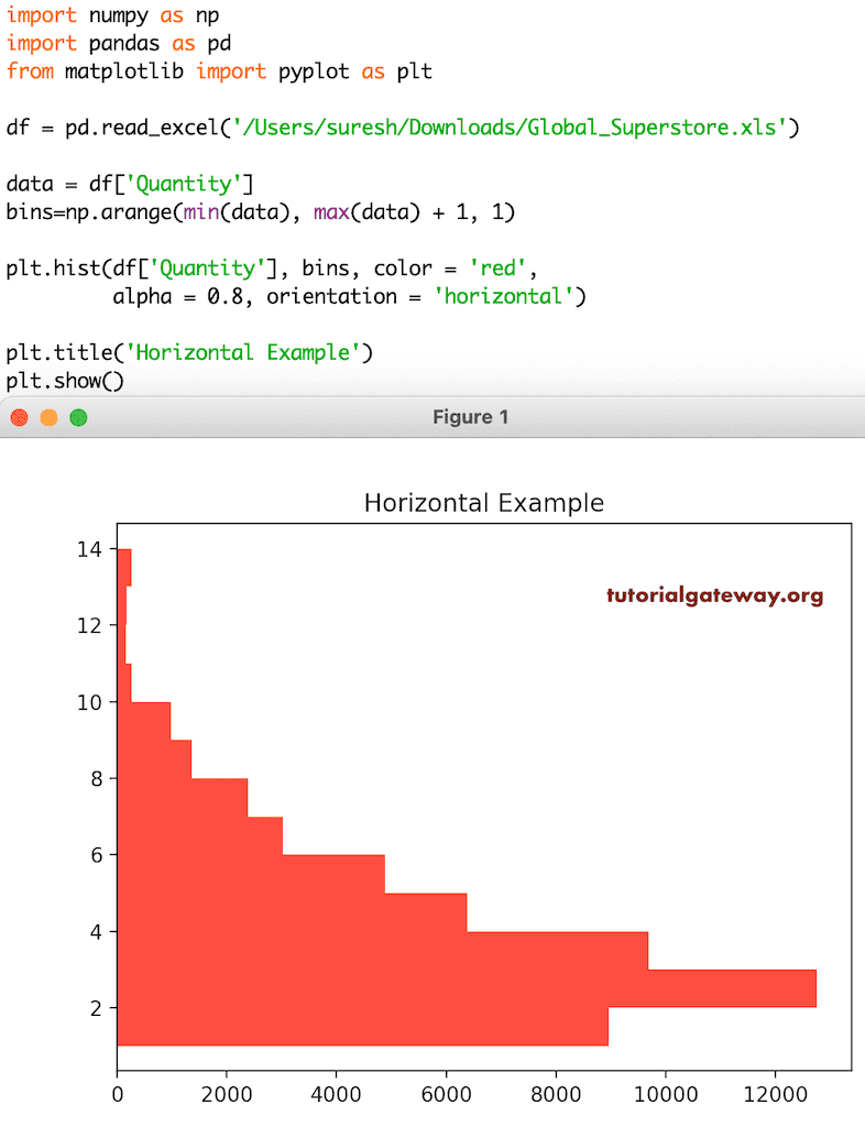
Python Matplotlib 水平直方图
pyplot 的 hist 函数有一个 orientation 参数,它有两个选项:horizontal(水平)和 vertical(垂直,默认)。如果您将此 orientation 参数设置为 horizontal,那么直方图将水平绘制。
import pandas as pd
from matplotlib import pyplot as plt

df = pd.read_excel('/Users/suresh/Downloads/Global_Superstore.xls')

data = df['Quantity']
bins=np.arange(min(data), max(data) + 1, 1)

plt.hist(df['Quantity'], bins, color = 'red',
         alpha = 0.8, orientation = 'horizontal')

plt.title('Horizontal Example')
plt.show()
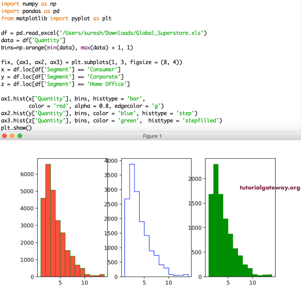
histtype
Python Matplotlib pyplot 直方图有一个 histtype 参数,它有助于将类型从一种更改为另一种。有四种类型的直方图可用,它们是:
- bar: 这是传统的条形图类型。如果您将多个数据与 histtype 设置为 bar 一起使用,那么这些值将并排排列。
- barstacked: 当您使用多个数据时,这些值会堆叠在一起。
- step: 没有填充条形的直方图。有点像折线图或瀑布图。
- stepfilled: 与上面相同,但空白区域填充了默认颜色。
df = pd.read_excel('/Users/suresh/Downloads/Global_Superstore.xls')

data = df['Quantity']
bins=np.arange(min(data), max(data) + 1, 1)

fix, (ax1, ax2, ax3) = plt.subplots(1, 3, figsize = (8, 4))

x = df.loc[df['Segment'] == 'Consumer']
y = df.loc[df['Segment'] == 'Corporate']
z = df.loc[df['Segment'] == 'Home Office']

ax1.hist(x['Quantity'], bins, histtype = 'bar', color = 'red', alpha = 0.8, edgecolor = 'g')
ax2.hist(y['Quantity'], bins, color = 'blue', histtype = 'step')
ax3.hist(z['Quantity'], bins, color = 'green',histtype = 'stepfilled')

plt.show()
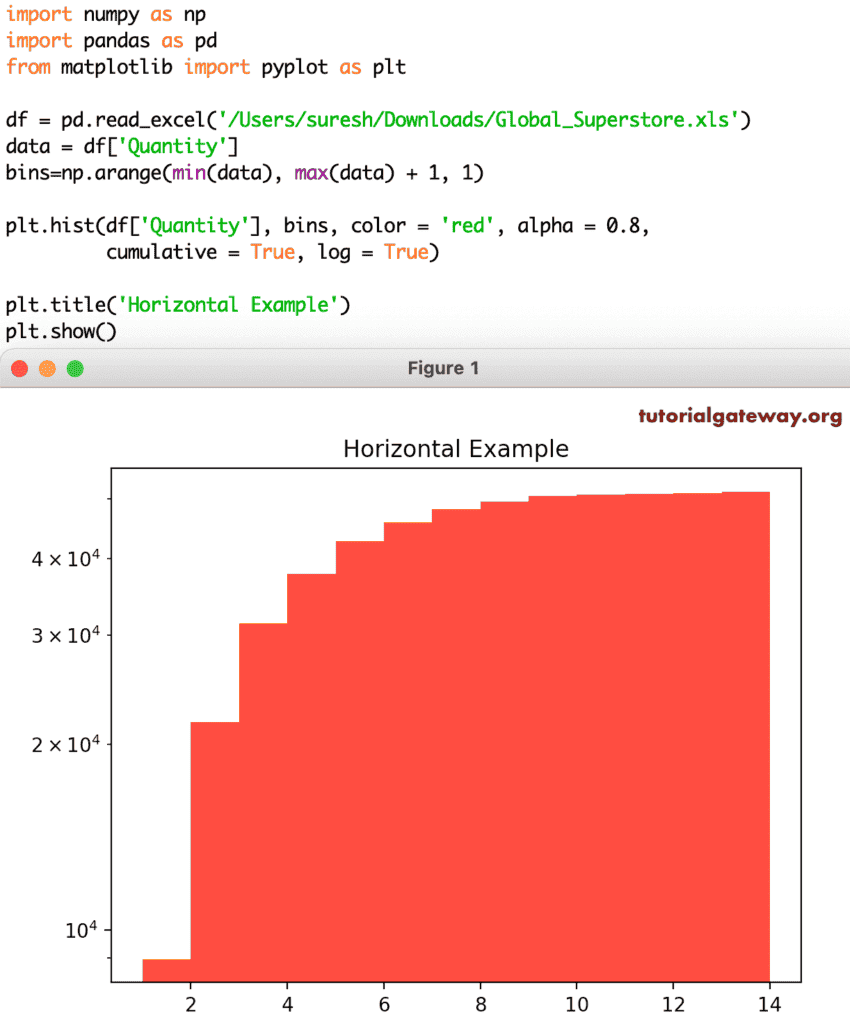
log 参数值接受布尔值,其默认值为 False。如果将其设置为 True,则轴将设置为对数刻度。除了 log,还有一个名为 cumulative 的参数,它有助于显示累积直方图。
df = pd.read_excel('/Users/suresh/Downloads/Global_Superstore.xls')

data = df['Quantity']
bins=np.arange(min(data), max(data) + 1, 1)

plt.hist(df['Quantity'], bins, color = 'red', alpha = 0.8,
         cumulative = True, log = True)

plt.title('Horizontal Example')

plt.show()
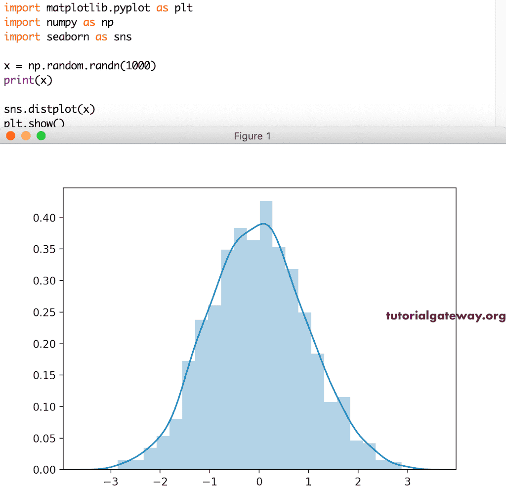
Seaborn 直方图
我们有一个 Seaborn 模块,它有助于绘制带有密度曲线的直方图。它非常简单直观。
import matplotlib.pyplot as plt
import seaborn as sns

x = np.random.randn(1000)
print(x)

sns.distplot(x)

plt.show()
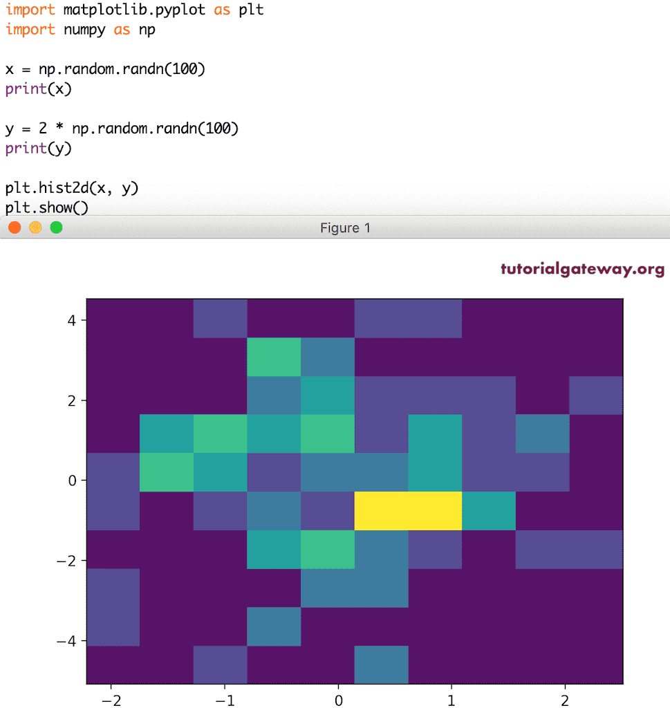
Python Matplotlib pyplot 2D 直方图
pyplot 有一个 hist2d 函数来绘制二维或 2D 直方图。要绘制 Matplotlib 2D 直方图,您需要两个数值数组或类似数组的值。
x = np.random.randn(100)
print(x)

y = 2 * np.random.randn(100)
print(y)

plt.hist2d(x, y)

plt.show()
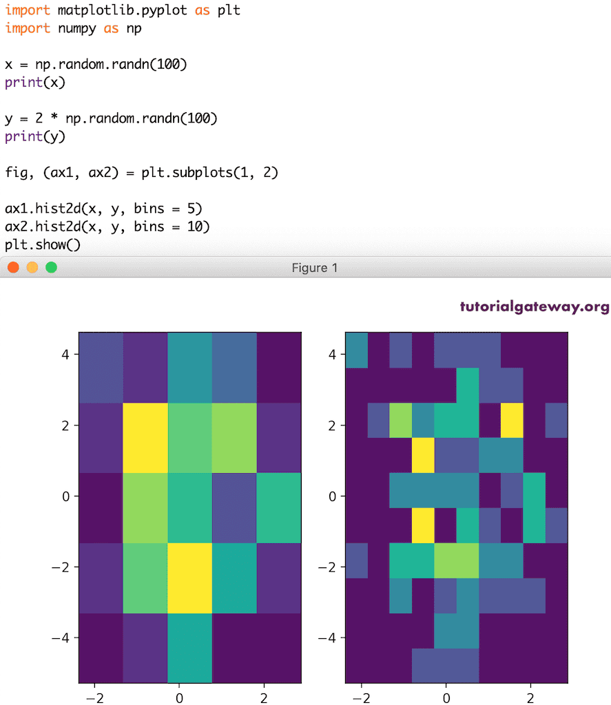
在此,我们使用了两个子图并改变了它们的大小。
x = np.random.randn(100)
print(x)

y = 2 * np.random.randn(100)
print(y)

fig, (ax1, ax2) = plt.subplots(1, 2)

ax1.hist2d(x, y, bins = 5)

ax2.hist2d(x, y, bins = 10)
plt.show()
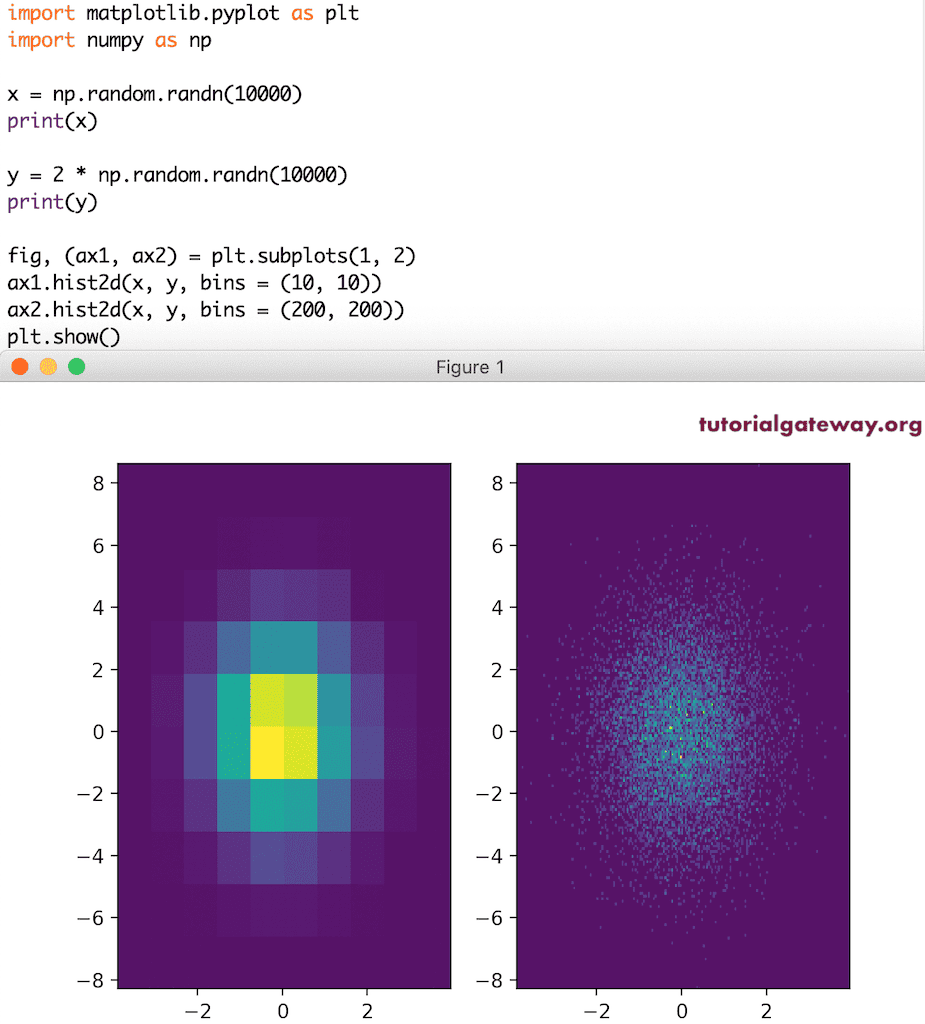
这是另一个二维直方图。
x = np.random.randn(10000)
print(x)

y = 2 * np.random.randn(10000)
print(y)

fig, (ax1, ax2) = plt.subplots(1, 2)

ax1.hist2d(x, y, bins = (10, 10))

ax2.hist2d(x, y, bins = (200, 200))
plt.show()
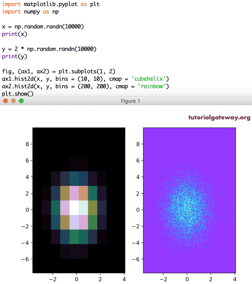
让我使用 cmap 参数改变直方图的颜色。
x = np.random.randn(10000)
print(x)

y = 2 * np.random.randn(10000)
print(y)

fig, (ax1, ax2) = plt.subplots(1, 2)

ax1.hist2d(x, y, bins = (10, 10), cmap = 'cubehelix')

ax2.hist2d(x, y, bins = (200, 200), cmap = 'rainbow')
plt.show()
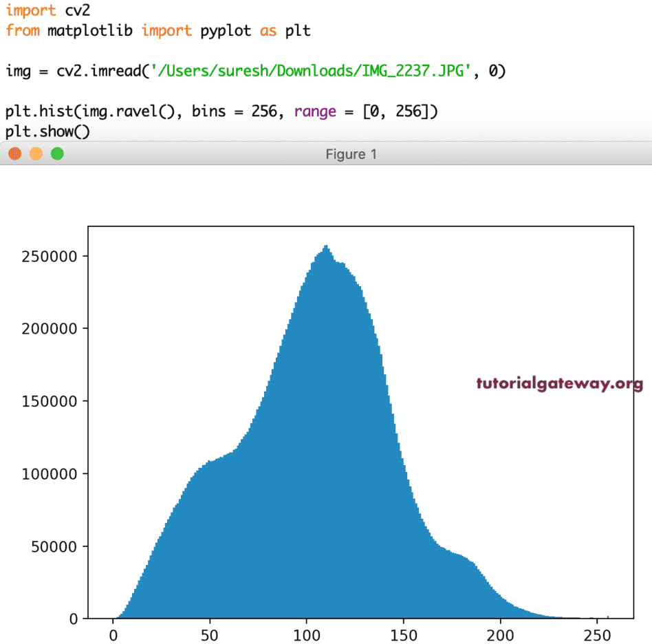
图像的直方图
除了上述指定的功能,您还可以使用直方图分析图像中的颜色。在本节中,我们展示了图像中的 RGB 颜色。
import cv2
from matplotlib import pyplot as plt

img = cv2.imread('/Users/suresh/Downloads/IMG_2065.JPG', 0)

plt.hist(img.ravel(), bins = 256, range = [0, 256])
plt.show()