R编程中的马赛克图对于可视化来自列联表或双向频率表的二维数据非常有用。R马赛克图绘制一个矩形,其高度代表比例值。从第二个例子中,您可以看到白色产品的销售在所有国家中都是最少的。
让我们看看如何在R编程语言中使用示例创建马赛克图、格式化其颜色、边框、阴影以及更改马赛克图的方向。
R 马赛克图语法
在R编程中绘制MosaicPlot或Mosaic Plot的语法如下所示
mosaicplot(x, color = NULL, main = "Title")
而这个马赛克图背后的复杂语法是
mosaicplot(x, sort = NULL, color = NULL, border = NULL,
        main = deparse(substitute(x), sub = NULL, xlab = NULL, ylab = NULL,
        off = NULL, dir = NULL, cex.axis = 0.66, shade = FALSE, margin = NULL,
        las = par("las"), type = c("Pearson", "deviance", "FT",…)
而这个马赛克图背后的基于公式的语法是
mosaicplot(formula, data = NULL, main = deparse(substitute(x),
           subset, na.action = stats::na.omit)
以下是R编程语言中马赛克图支持的参数列表
- data: 请指定包含绘制马赛克图数据的 DataFrame 或 List。在本例中,它是 airquality 和 products。
- subset: 您可以通过指定值的向量来限制马赛克图的绘制数据。例如,您可以将马赛克图限制为仅女性人群。
- x: 请指定您要从中绘制马赛克图的数据。这里,您需要使用数组形式的列联表。您可以使用 table() 函数从您的 DataFrame 创建一个表。
- sort: 对 向量 变量进行排序。
- margin: 请指定一个包含边际总计的向量列表。
- na.action: 这里,您需要指定您对包含NA的变量的立场。默认情况下,马赛克图会省略带有NA的案例,但您可以使用此参数将这些NA值替换为更有意义的值。
- cex.axis: 用于坐标轴注释
- type: 请指定一个表示要表示的残差类型的字符字符串。
在R中创建基本马赛克图
在本例中,我们展示了如何使用RStudio提供的airquality数据集创建马赛克图。
# Mosaic Plot Example
airquality

table1 <- table(airquality$Temp, airquality$Month)
mosaicplot(table1)
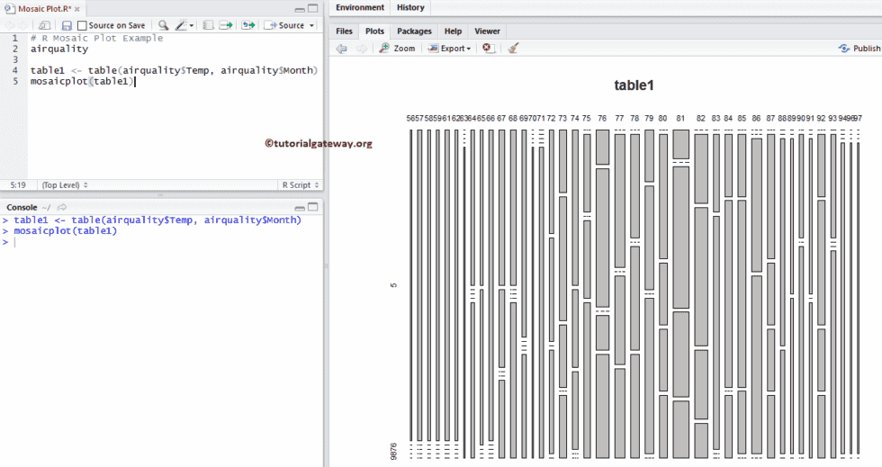
首先,我们为空气质量温度和月份创建了一个表格
table1 <- table(airquality$Temp, airquality$Month)
接下来,我们使用mosaicplot函数绘制马赛克图。从下面的代码片段中,您可以观察到我们使用了表格来绘制马赛克图。
mosaicplot(table1)
在R编程中创建马赛克图
在本例中,我们展示了如何使用外部数据创建马赛克图。为此,我们使用read.csv函数从csv文件导入数据。我建议您参考R Read CSV文章来在R编程中导入CSV文件。
# Mosaic Plot Example
getwd()

employee <- read.csv("Products.csv", TRUE, sep = ",",
                     na.strings = TRUE)

count <- table(employee$EnglishCountryRegionName,
               employee$Color)
count
mosaicplot(count)
在此马赛克图示例中,以下语句从CSV文件导入数据
employee <- read.csv("Products.csv", TRUE, sep = ",",
                     na.strings = TRUE)
从下面的代码片段中,可以看出我们使用table()函数为产品颜色和国家名称创建了一个表格。
count <- table(employee$EnglishCountryRegionName,
               employee$Color)
上述语句返回输出为表格。因此,我们使用该表格来绘制马赛克图。
mosaicplot(count)
为R编程中的马赛克图指定名称
在本例中,我们使用main、xlab、ylab和sub为马赛克图标题、X轴和Y轴分配名称。
- main: 您可以更改或提供马赛克图标题的字符串。
- sub: 您可以为您的马赛克图提供副标题(如果有)。
- xlab: 请指定X轴的标签
- ylab: 请指定Y轴的标签
- las: 用于更改Y轴值的方向。
# Mosaic Plot Example - Adding Names
getwd()

employee <- read.csv("Products.csv", TRUE, sep = ",",
                     na.strings = TRUE)

count <- table(employee$EnglishCountryRegionName,
               employee$Color)
count
mosaicplot(count, main = "Countries Mosaic Plot",
           sub = "Product Colors by Country",
           xlab = "Countries",
           ylab = "Colors",
           las = 1)
更改R中马赛克图的颜色
在本例中,我们使用color参数更改马赛克颜色,并使用border参数更改边框颜色。
- color: 请指定您想用于马赛克图着色的逻辑值或颜色向量。当shade参数设置为FALSE或NULL(默认值)时,使用此参数。在您的控制台中输入colors()以获取R编程中可用的颜色列表。
- border: 请指定您想添加的边框颜色。
# Mosaic Plot Example - Adding Names
getwd()

employee <- read.csv("Products.csv", TRUE, sep = ",",
                     na.strings = TRUE)

count <- table(employee$EnglishCountryRegionName,
               employee$Color)
count
mosaicplot(count, main = "Countries Mosaic Plot",
           sub = "Product Colors by Country",
           xlab = "Countries",
           ylab = "Colors",
           las = 1,
           color = "skyblue2",
           border = "chocolate")

提示: 要为马赛克图分配不同的颜色,您必须使用颜色向量。例如,color = c("red", "black", "green", ...)
R编程中的水平马赛克图
在此图示例中,我们展示了如何使用dir参数更改马赛克图的方向。
- dir: 请为马赛克图的每个级别指定一个拆分方向向量。这里,“v”表示垂直,“h”表示水平。
# Mosaic Plot Example - Changing Direction
getwd()

employee <- read.csv("Products.csv", TRUE, sep = ",",
                     na.strings = TRUE)

count <- table(employee$EnglishCountryRegionName,
               employee$Color)
count
mosaicplot(count, main = "Countries Mosaic Plot",
           sub = "Product Colors by Country",
           xlab = "Colors",
           ylab = "Countries",
           las = 1,
           dir = c("h", "v"),
           color = "skyblue2",
           border = "chocolate")
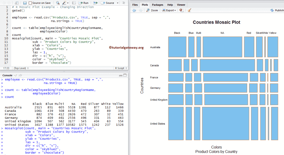
从上面的屏幕截图中,您可以观察到我们更改了水平轴为垂直轴,反之亦然。
更改马赛克图的阴影
在此马赛克图示例中,我们展示了如何使用shade参数
- shade: 一个逻辑值,指示是否生成扩展的马赛克图。您还可以使用最多5个正数的数字向量。
# Mosaic Plot Example - Changing Direction
getwd()

employee <- read.csv("Products.csv", TRUE, sep = ",",
                     na.strings = TRUE)

count <- table(employee$EnglishCountryRegionName,
               employee$Color)
count
mosaicplot(count, main = "Countries Mosaic Plot",
           sub = "Product Colors by Country",
           xlab = "Colors",
           ylab = "Countries",
           las = 1,
           border = "chocolate",
           shade = TRUE)

增加马赛克图之间的空间
在此图示例中,我们使用off参数增加每个马赛克图之间的空间。
- off: 请指定一个偏移值向量,以确定马赛克图中每个级别的间隔百分比。默认值为20,近似值在0到20之间。
# R Mosaic Plot Example - Changing Offset
getwd()

employee <- read.csv("Products.csv", TRUE, sep = ",",
                     na.strings = TRUE)

count <- table(employee$EnglishCountryRegionName,
               employee$Color)
count
mosaicplot(count, main = "Countries Mosaic Plot",
           sub = "Product Colors by Country",
           xlab = "Colors",
           ylab = "Countries",
           las = 1,
           border = "chocolate",
           off = 30,
           shade = TRUE)

使用公式创建马赛克图
在本例中,我们使用formula参数创建马赛克图。
- formula: 它应该是类似于 y~x 的形式
# R Mosaic Plot Example - Changing Offset
getwd()

employee <- read.csv("Products.csv", TRUE, sep = ",",
                     na.strings = TRUE)

mosaicplot(employee$EnglishCountryRegionName~employee$Color,
           main = "Countries Mosaic Plot",
           sub = "Product Colors by Country",
           xlab = "Countries",
           ylab = "Colors",
           las = 1,
           border = "chocolate",
           shade = TRUE)
