R语言的lattice包提供了 xyplot 函数来绘制散点图。这种R中的lattice散点图非常有助于可视化两组数据之间的关系。您可以将此R散点图称为散点图、散点图、散点图或散点图。
例如,为了可视化薪资与经验的关系,可以使用此散点图。让我们通过一个例子看看如何在R语言中创建Lattice散点图,以及如何设置其颜色、形状等。 绘制Lattice散点图或Lattice散点图的语法是
xyplot(x, data, ...)
下面是lattice散点图的复杂语法
xyplot(x, data,
       allow.multiple = is.null(groups) || outer,
       outer = !is.null(groups),
       auto.key = FALSE,
       aspect = "fill",
       panel = lattice.getOption("panel.xyplot"),
       prepanel = NULL,
       scales = list(),
       strip = TRUE,
       groups = NULL,
       xlab, xlim, ylab, ylim,
       drop.unused.levels = lattice.getOption("drop.unused.levels"),
       ...,
       lattice.options = NULL,
       default.scales,
       default.prepanel = lattice.getOption("prepanel.default.xyplot"),
       subscripts = !is.null(groups),
       subset = TRUE)
为此,我们将使用R提供的diamonds数据集,该数据集中的数据是
在R中创建Lattice散点图
在此示例中,我们展示了如何使用lattice包中的xyplot函数创建散点图。为此,我们使用的是R Studio提供的diamonds数据集。如果需要从外部文件导入R编程数据,我建议您参考R Read CSV文章来理解CSV文件导入。
# Create Scatter Plot using Lattice package

# Importing the lattice library
library(lattice)

# Creating Scatter Plot
xyplot(price ~ carat, data = diamonds)
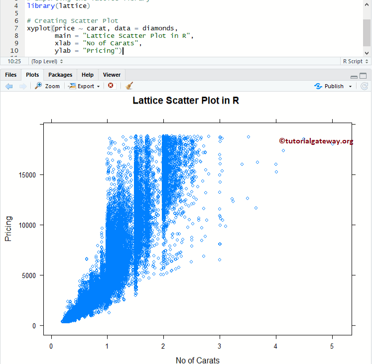
为Lattice散点图指定名称
此示例显示了如何使用main、xlab和ylab来为lattice散点图、X轴、Y轴和各个条形分配名称
- main:散点图的主标题。
- xlab:X轴的标签
- ylab:Y轴的标签
# Change Names of a Lattice Scatter Plot

# Importing the lattice library
library(lattice)

# Creating Scatter Plot
xyplot(price ~ carat, data = diamonds,
       main = "Lattice Scatter Plot in R",
       xlab = "No of Carats",
       ylab = "Pricing")
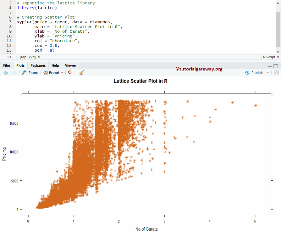
更改Lattice散点图的形状和颜色
在此示例中,我们展示了如何使用col和cex参数在R中更改lattice散点图的形状和颜色。
- col:请指定您要在散点图中使用的颜色。
- cex:指定点的大小
- pch:更改形状。
# Change Shapes, Colors of a Lattice Scatter Plot

# Importing the lattice library
library(lattice)

# Creating Scatter Plot
xyplot(price ~ carat, data = diamonds,
       main = "Lattice Scatter Plot in R",
       xlab = "No of Carats",
       ylab = "Pricing",
       col = "chocolate",
       cex = 0.8,
       pch = 8)
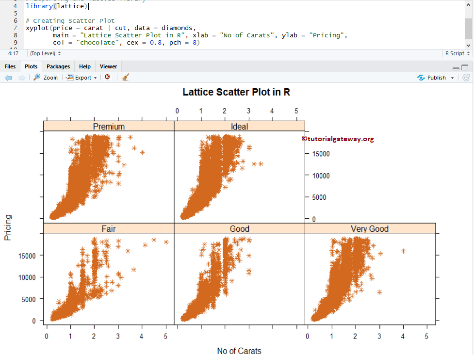
多个Lattice散点图
在此示例中,我们展示了如何使用groups分割散点图。
# Linear Progression on a Lattice Scatter Plot

# Importing the lattice library
library(lattice)

# Creating Scatter Plot
xyplot(price ~ carat | cut, data = diamonds,
       main = "Lattice Scatter Plot in R", xlab = "No of Carats", ylab = "Pricing",
       col = "chocolate", cex = 0.8, pch = 8)
在这里,散点图根据Cut进行分割。