R中的Lattice直方图有助于可视化统计信息。尽管它看起来像条形图,但直方图以相等的区间显示数据。让我们看看如何使用lattice库创建Lattice直方图,设置其颜色,添加标签并绘制多个直方图。
R中的Lattice直方图语法
在此编程中绘制Lattice直方图的基本语法是:
histogram(x,
          data,
          allow.multiple, outer = TRUE,
          auto.key = FALSE,
          aspect = "fill",
          panel = lattice.getOption("panel.histogram"),
          prepanel, scales, strip, groups,
          xlab, xlim, ylab, ylim,
          type = c("percent", "count", "density"),
          nint = if (is.factor(x)) nlevels(x)
          else round(log2(length(x)) + 1),
          endpoints = extend.limits(range(as.numeric(x), finite = TRUE), prop = 0.04),
          breaks,
          equal.widths = TRUE,
          drop.unused.levels = lattice.getOption("drop.unused.levels"),
          ...,
          lattice.options = NULL,
          default.scales = list(),
          default.prepanel = lattice.getOption("prepanel.default.histogram"),
          subscripts,
          subset).)
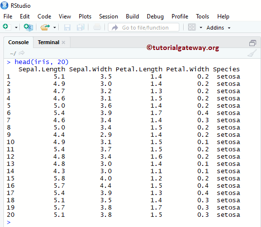
在开始示例之前,让我们看一下我们将用于此Lattice直方图示例的数据。iris是Studio提供的数据集。
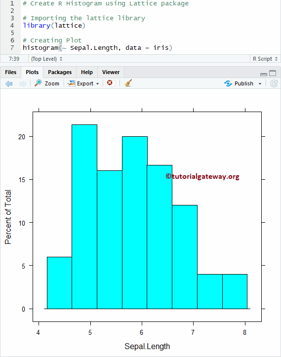
在R中创建Lattice直方图
在此示例中,我们将向您展示如何使用Studio提供的iris数据集创建Lattice直方图。
# Importing the lattice library
library(lattice)

# Creating Plot
histogram(~ Sepal.Length, data = iris)
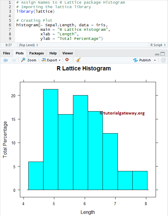
为R中的Lattice直方图命名
如果您需要从外部文件导入R编程数据,请参阅R Read CSV文章。在此示例中,我们将展示如何使用main,xlab和ylab为Lattice直方图、X轴和Y轴指定名称。
- main:您可以更改或提供直方图的标题。
- xlab:请指定 X 轴的标签。
- ylab:请指定Y轴的标签。
# Assign Names to R Lattice package Histogram

# Importing the lattice library
library(lattice)

# Creating Plot
histogram(~ Sepal.Length, data = iris,
          main = "R Lattice Histogram",
          xlab = "Length",
          ylab = "Total Percentage")
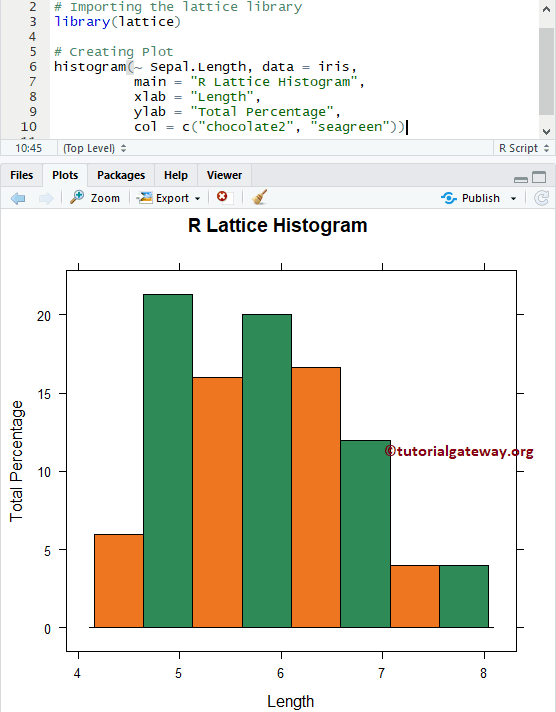
更改R中Lattice直方图的颜色
在此示例中,我们将向您展示如何使用col参数更改Lattice直方图的颜色。在控制台中输入colors()以获取R编程中可用颜色的列表。
# Change Colors of a R Lattice package Histogram
# Importing the lattice library
library(lattice)

# Creating Plot
histogram(~ Sepal.Length, data = iris,
          main = "R Lattice Histogram",
          xlab = "Length",
          ylab = "Total Percentage",
          col = c("chocolate2", "seagreen"))
从上面的代码中,您可以看到我们为col参数使用了两种颜色。这意味着这两种颜色将一直重复到条形的末端。
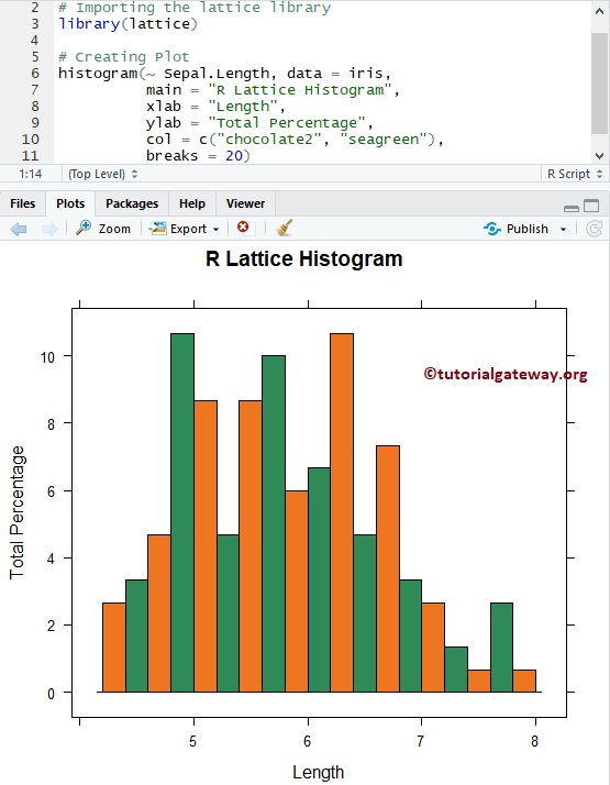
更改直方图的箱数
在此示例中,我们将展示如何使用breaks参数更改Bin大小。您可以使用值向量指定直方图单元之间的断点。使用数字指定直方图应返回的单元数量。例如,breaks = 10表示返回10个条形。
# Lattice Histogram Example - Changing Bins
# Importing the lattice library
library(lattice)

# Creating Plot
histogram(~ Sepal.Length, data = iris,
          main = "R Lattice Histogram",
          xlab = "Length",
          ylab = "Total Percentage",
          col = c("chocolate2", "seagreen"),
          breaks = 20)
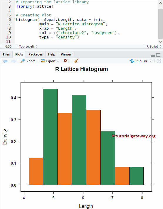
创建带有密度的Lattice直方图
在此示例中,我们将展示如何创建相对于密度的Lattice直方图。要实现此目的,我们将type参数设置为density。
# Create Lattice Histogram - Density
# Importing the lattice library
library(lattice)

# Creating Plot
histogram(~ Sepal.Length, data = iris,
          main = "R Lattice Histogram",
          xlab = "Length",
          col = c("chocolate2", "seagreen"),
          type = "density")
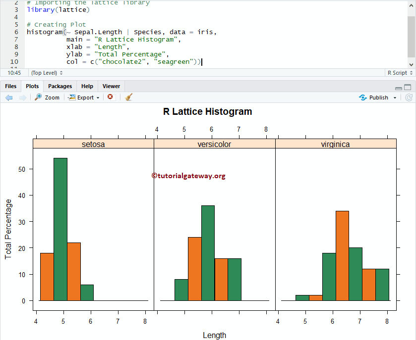
多个Lattice直方图
在此示例中,我们将向您展示如何将多个直方图添加到绘图区域。
# Create Multiple Lattice Histogram
# Importing the lattice library
library(lattice)

# Creating Plot
histogram(~ Sepal.Length | Species, data = iris,
          main = "R Lattice Histogram",
          xlab = "Length",
          ylab = "Total Percentage",
          col = c("chocolate2", "seagreen"))